The Prototype
Our InVision prototype can be found here. The following is an overview of our high fidelity prototype:

Task 1: Event Discovery and Notification
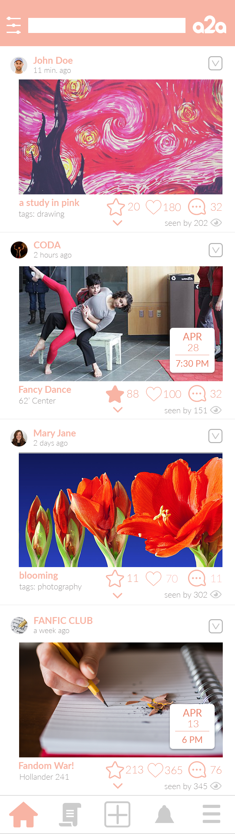
A user browses their feed, which is populated with artwork, discussions, and events related to interests that they list upon first login (and which they can modify under settings), as well as to groups that they follow.

When a user sees an event for which they’d like to be notified, they press the star icon.
When the time comes, a2a notifies them of the upcoming event. When the user opens the app, they are brought to the notifications page.
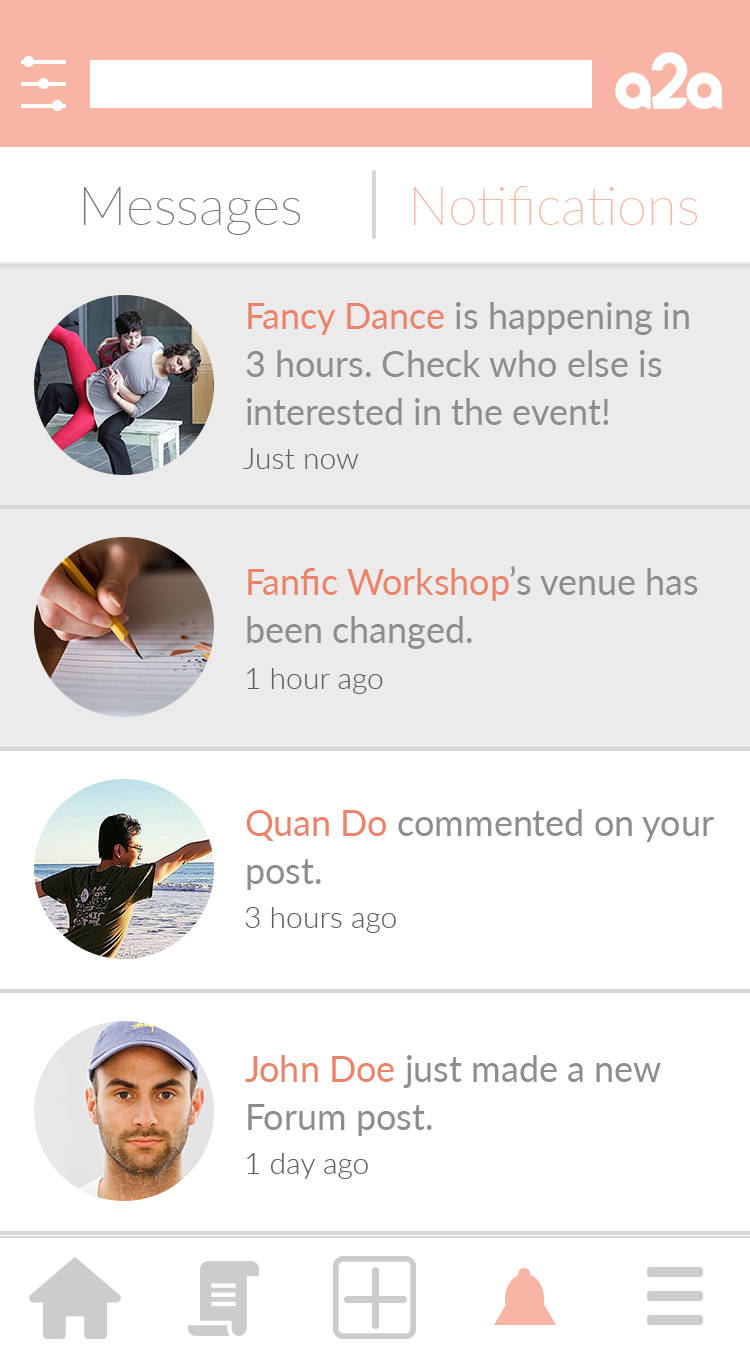
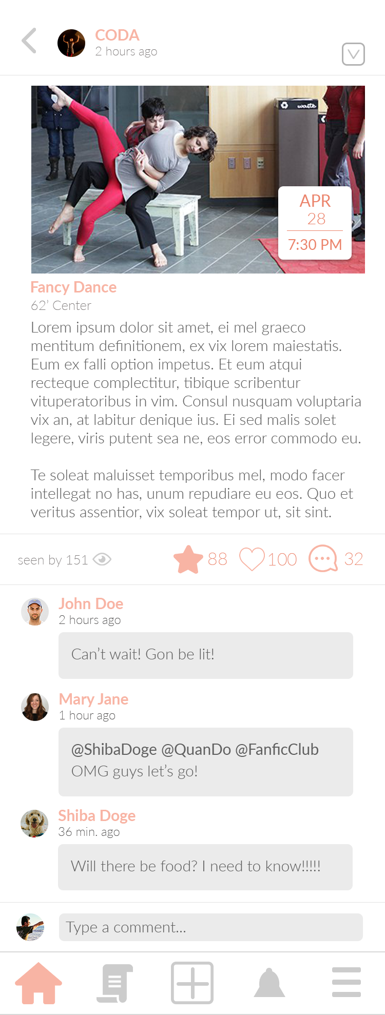
If they touch the thumbnail for the event, they can view the event page for more details.
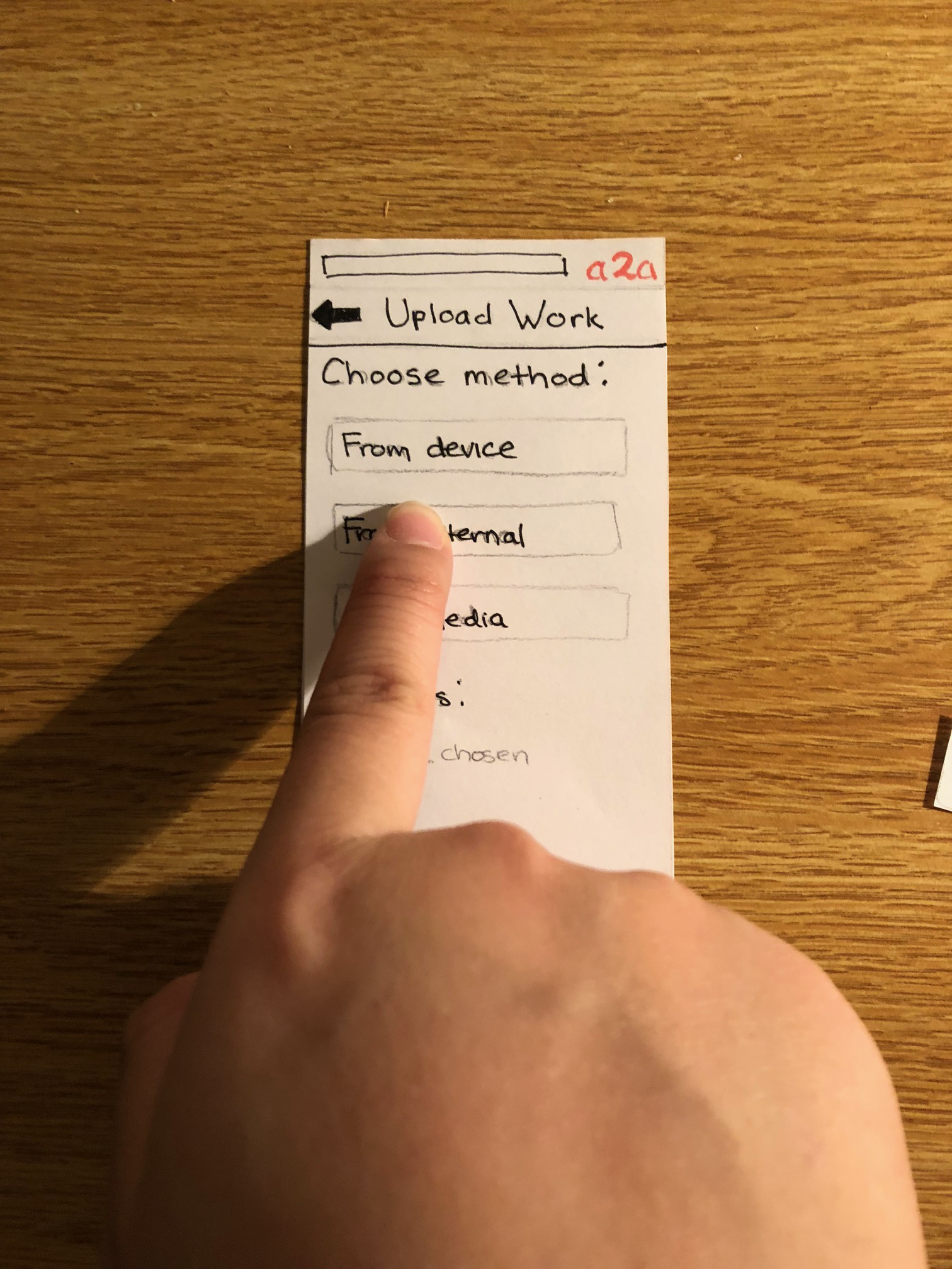
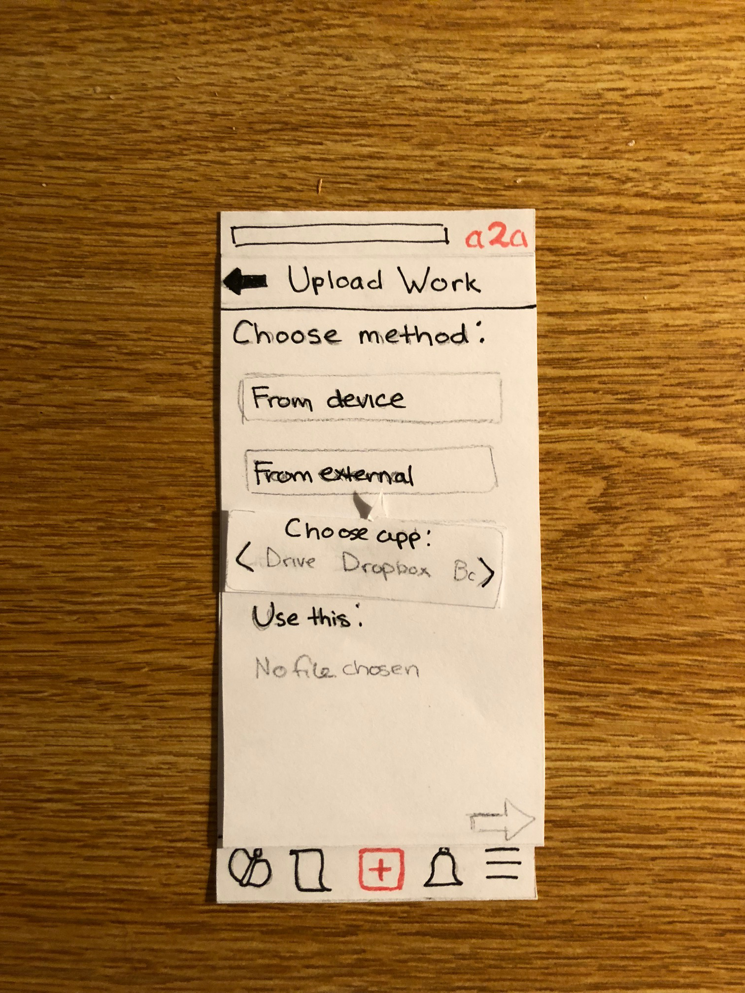
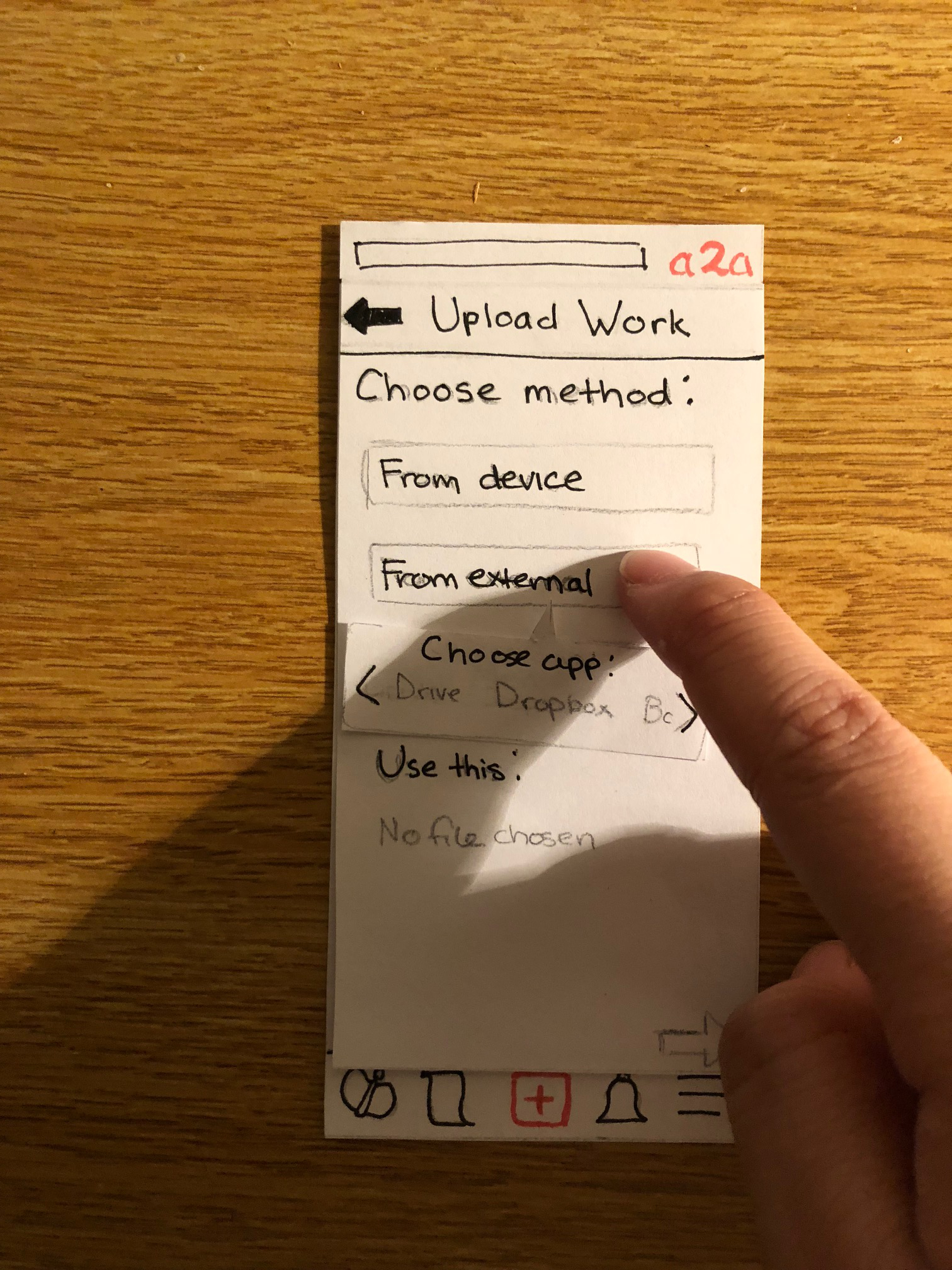
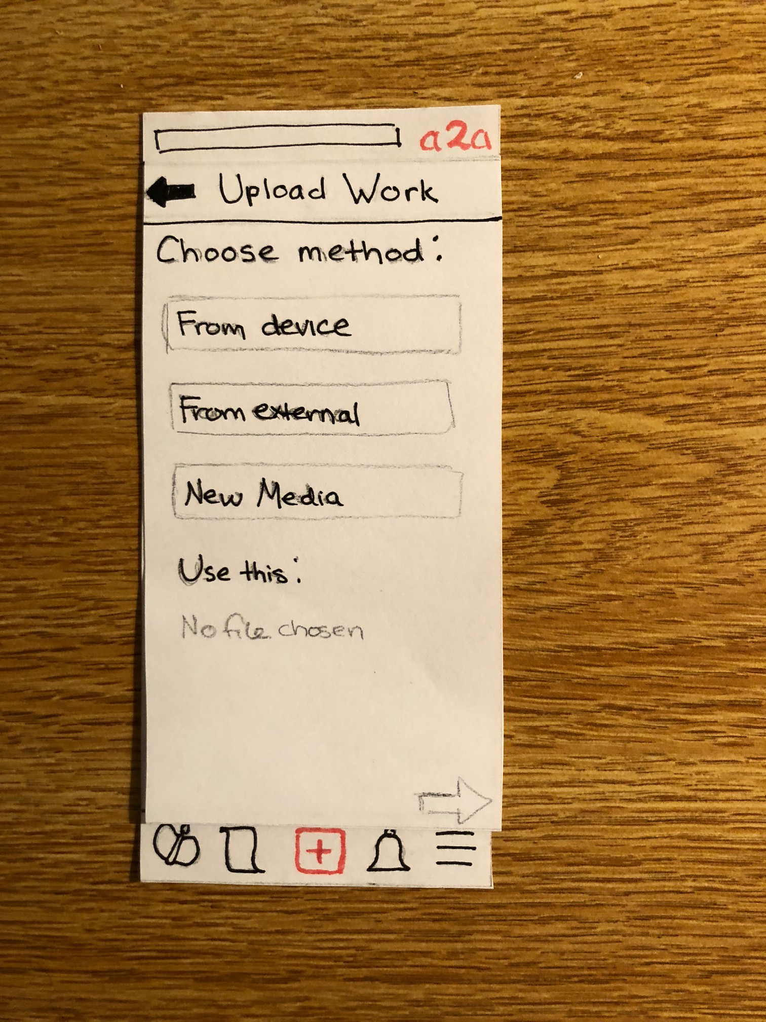
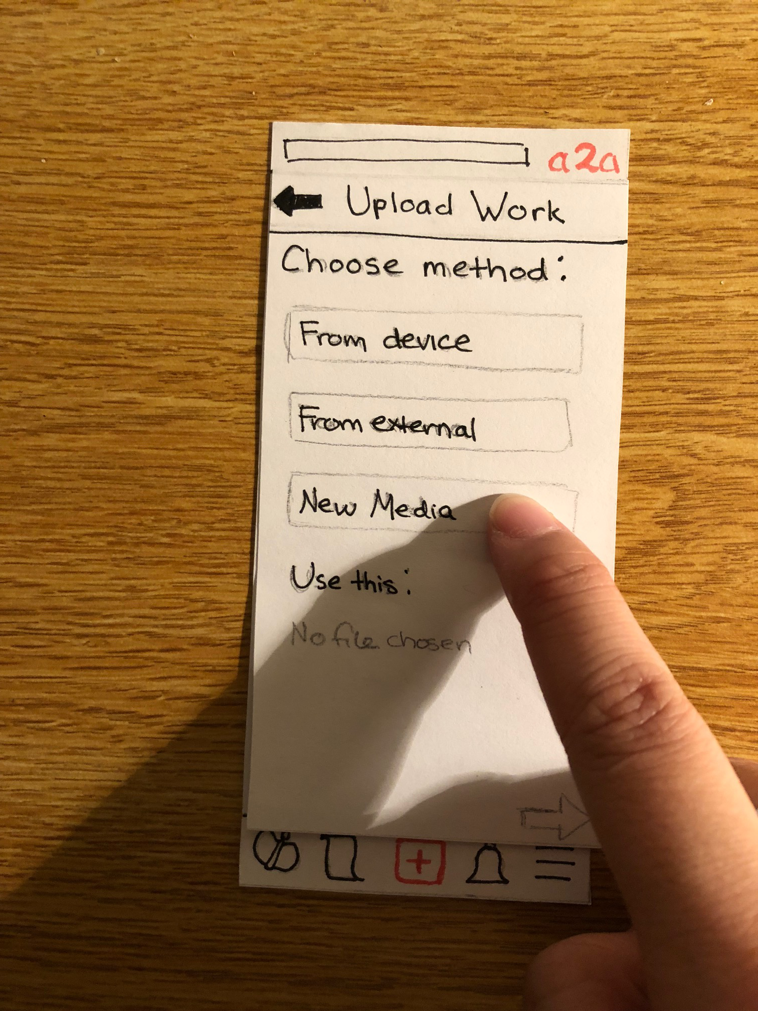
Task 2: Art Showcasing
When a user would like to upload an image, they touch the “plus” icon, which will bring them to the following page:
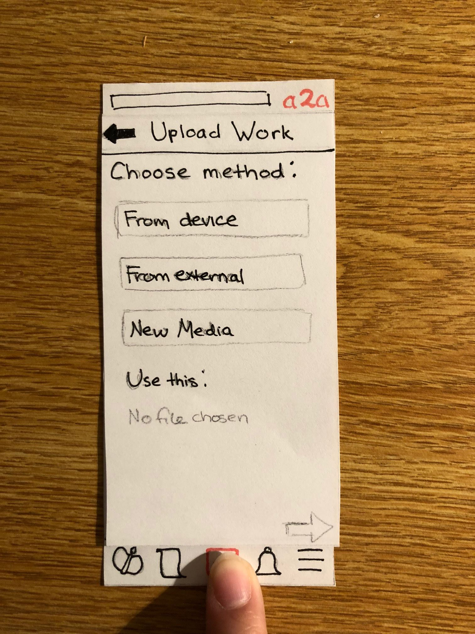
Pressing the peach-colored “choose file” button calls a menu which allows them to decide from where they’d like to take the art file to upload.
The app will communicate with the selected source, allowing the user to view their files and select one.
The user may also input additional information, such as a title for their work, a description, and some tags to help users find the piece via search bar. Upon satisfaction, the user presses the upload button and their work is shared with the community.
Implementation Decisions / Design Changes
Feed Post Buttons
Some usability test participants commented that they could not recognize the Follow button on a post, confusing it with a Seen icon indicating view counts. We reworked our Follow button to a Star button for clarity, and also added a real Seen icon to let users know how well posts reach other users. We also recolored all interact-able buttons to peach (the app’s accent color), and other icons grey.
Upload Text Fields
We changed the appearance of all text fields in the upload page from text boxes to borderless fields, indicated by simple lines under the texts. This helps preserve consistency with other parts of the app, such as the onboarding text fields.
Things We Decided Not to Implement Yet
There are a few pieces of our app which, while important to the overall product, are not relevant to our two main tasks. The entire functionality relating to groups, while important for establishing how the events which users can follow appear, are not important to the discovery and notification itself, nor is it relevant to art showcasing through the app. Profile editing is similarly important, but our main focus at this point is the primary task of showcasing that art, not editing what’s already been uploaded. The workflow for partaking in discussions is also not included. For the sake of creating high-fidelity prototype in four days without going overboard, we prioritized things that we thought a user would more directly encounter while performing our two main tasks.
Image/Icon Reference
We utilized a number of stock images and icons for our prototype.
Icons
Scroll: Flaticon
Camera: Iconfinder
Home: Iconfinder
Heart: Flaticon
Comment: Flaticon
More: Iconfinder
Eye: Iconfinder
Star: Iconfinder
Down carat: Iconfinder
Images
Profile picture 1: Asphaltgold
Profile pic 2: iStock
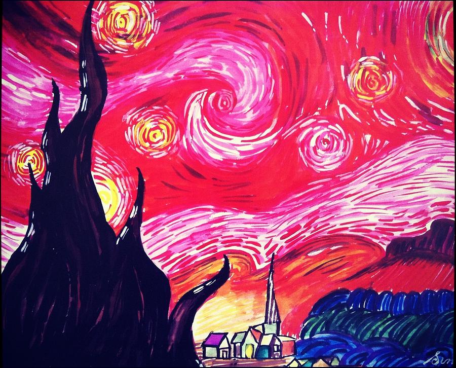
Study in pink: Red Starry Night by Sumit Jain
Blooming: Pixabay
CODA profile: Williams Dance Department
CODA event: Williams Dance Department
Fanfic club profile: Petar Milošević
.jpg)
Fanfic event: Unsplash
Dog: Unsplash