Testing Process:
The main goal for this round of user testing was to test the workflows that we designed to complete our two tasks: art showcasing and event discovery. Additionally, because we designed an onboarding process as part of our paper prototype, we wanted to test that workflow as well. We designed our user testing method as follows: We conducted each user interview with one willing user and two team members. One team member was in charge of introducing the user to the process, assigning tasks to the user, and writing notes about the user’s actions. The other team member acted as the ‘human’ computer. We split the user test into three parts; for each part the user was asked to complete a different task. The tasks were Setting up a new account as a new user, uploading work to personal portfolio, and discovering an event and following it. After introducing the user to the product, we asked them to complete these three tasks while thinking aloud as much as possible. If the user asked for help, the question was noted and the interviewer would give an appropriate amount of help.
Selection Process:
For participants, our team chose to user test three different students on campus. We decided to interview a student that we had previously performed a contextual inquiry with because he already knew the context of our project, so could potentially perform all the tasks but more importantly could give broader feedback on the designs in how they help achieve the broader goal of our project. For the other two interviewees, we chose one artist and one non-artist (both students) to cover the different potential user groups.
Usability Tests
User Test 1
KY is an undergraduate student at Williams studying Computer Science. KY represents our typical user, a student at a rural, small college who produces art in their spare time, and constantly seeks out new arts and artists in the vicinity. We conducted the test in Jesup, one of the prime study spots on campus (students work on works and look through phone to explore).
For the test, we provided some background on our project and explained that we want him to complete a task on the interface, thinking out loud in the process. We described each task we wanted KY to do before letting him use the application and did not answer questions or provide help as he was performing the tasks. Quan was the computer, Grace was the observer, and both were facilitators.
From this interview, there were a couple of workflows in our app that trapped a user on screens (lacking back buttons in our paper prototypes), so we quickly added those in for the second and third user interviews. We also had some issues with our tasks not being specific enough, which caused KY to stray from the path we intended they’d take, and so we revised our tasks to be more specific for the next two tests.
User Test 2
LL is an undergraduate student at Williams. LL represents our typical user, a student at a rural, small college who does art, actively participates in collaborations and wants to find other artists on campus. We conducted the test in Mission, a typical study spot for LL.
For this test, we provided background information on the app, presented a scenario and had LL fulfill our two revised tasks given the scenario. We described each task we wanted LL to do, giving her a specific scenario and goal without telling them the specifics on how to get there. For example, we said, “You’ve just completed a drawing for an in-class assignment and are very proud of it. You’d like to share this work, ‘Portait in Green’, with the rest of the Williams community. You’ve already a photograph of the drawing and uploaded it to Drive. Please upload the image to a2a so that the wider Williams community can see it.” We then prompted them to think aloud before letting them use the application and did not answer questions or provide help as they was performing the tasks. Because we had previously run into issues with a user telling us what actions they would have done instead of physically acting them (i.e. “I would press this button” vs. using their finger to press the part of the paper prototype that represented a button), we specifically informed the interviewee that nothing would happen if they did not physically interact with the paper prototype. Grace was the computer, Dawn was the observer, and both were facilitators.
From this interview, both tasks were easily accomplished with the new back buttons and the more concrete sense of direction, so LL did not have any pressing issues. There was some confusion about button placement on the feed, but we did not immediately change this feature for the next tester, as the time between before our next test was too short to change all of the paper prototypes.
User Test 3
SM is an undergraduate student at Williams. SM represents an atypical user, as they appreciate and produce art, but have never really been invested in the local art community here. We conducted the test in Sawyer Library, a favored work and study spot for SM.
For the test, we provided the usual background information on the app, presented our scenario and had SM fulfill our two tasks based on this. As we did with LL, we described each task we wanted SM to do (giving context with an appropriate scenario), prompted them to think aloud before letting them use the application, and did not answer questions or provide help as they were performing the tasks. Grace was the computer, Dawn was the observer, and both were facilitators.
As with LL, both tasks were easily accomplished with the new back buttons and concrete sense of direction guiding the tasks, so SM did not have any pressing issues. There was still some confusion about button placement and overall app functionality, as the user was not aware of capabilities of the app.
Results
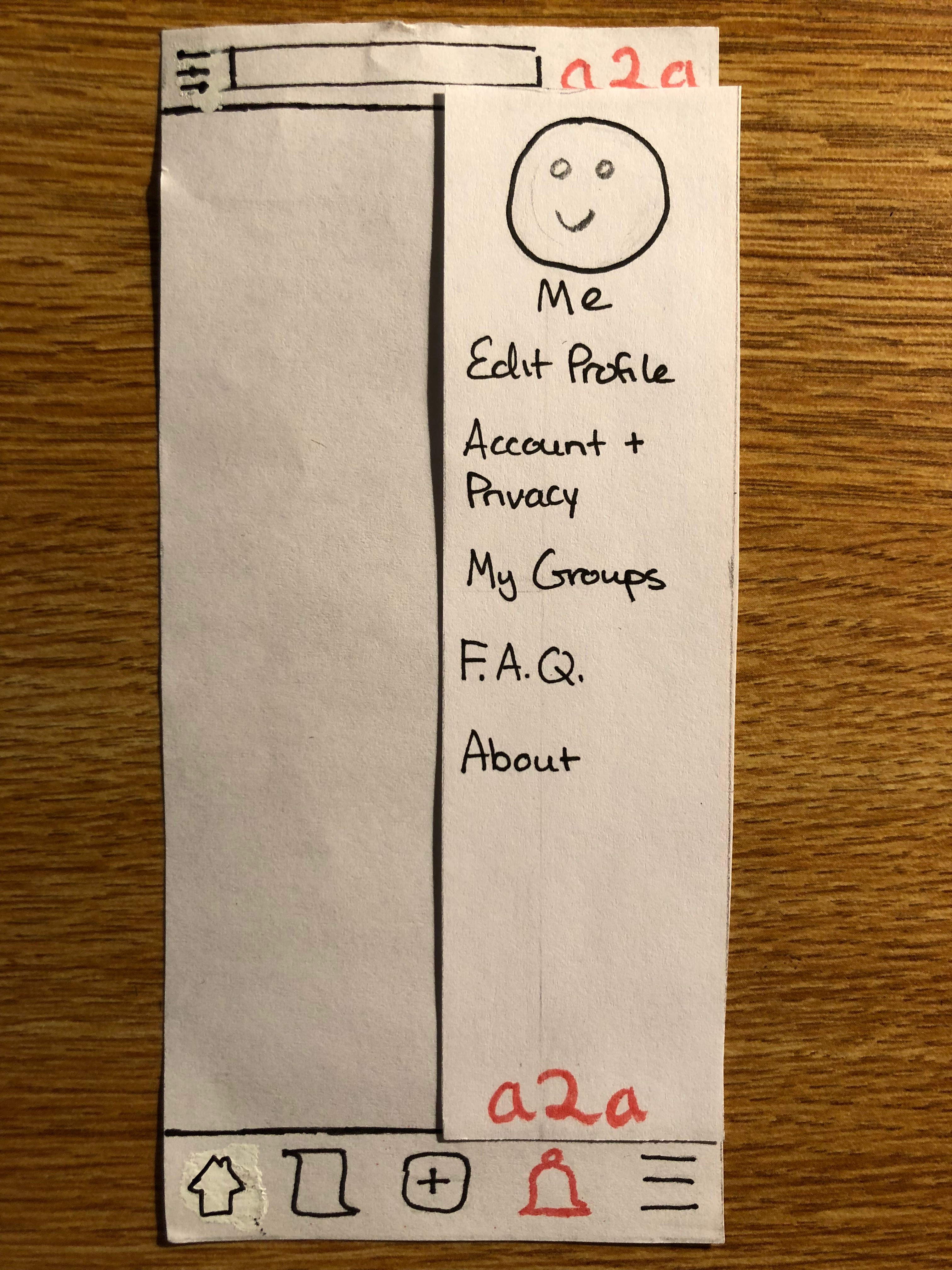
Incident 1: Edit Profile
User discovered an inability to edit user profile because no button / workflow for it existed.
Severity: Low
Explanation: This was an oversight on our part, and so we added the ability to edit user profile workflow under the settings tab.
Visual
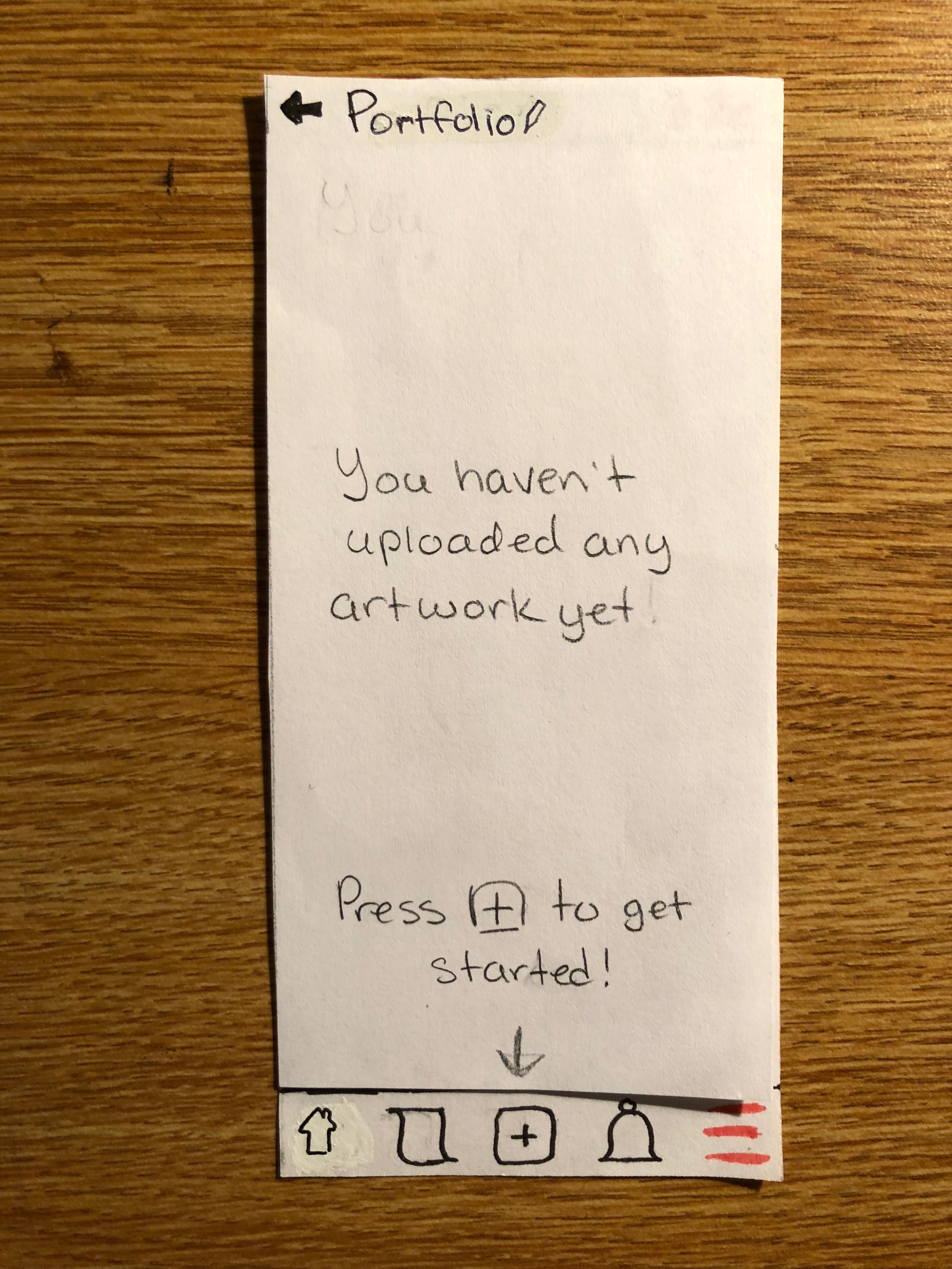
Incident 2: Edit Portfolio
User was not able to see portfolio before they had added anything.
Severity: Low
Explanation: We didn’t think to create this page when we originally made our paper prototypes. This was easily fixed by quickly creating the empty portfolio page for future user tests.
Visual
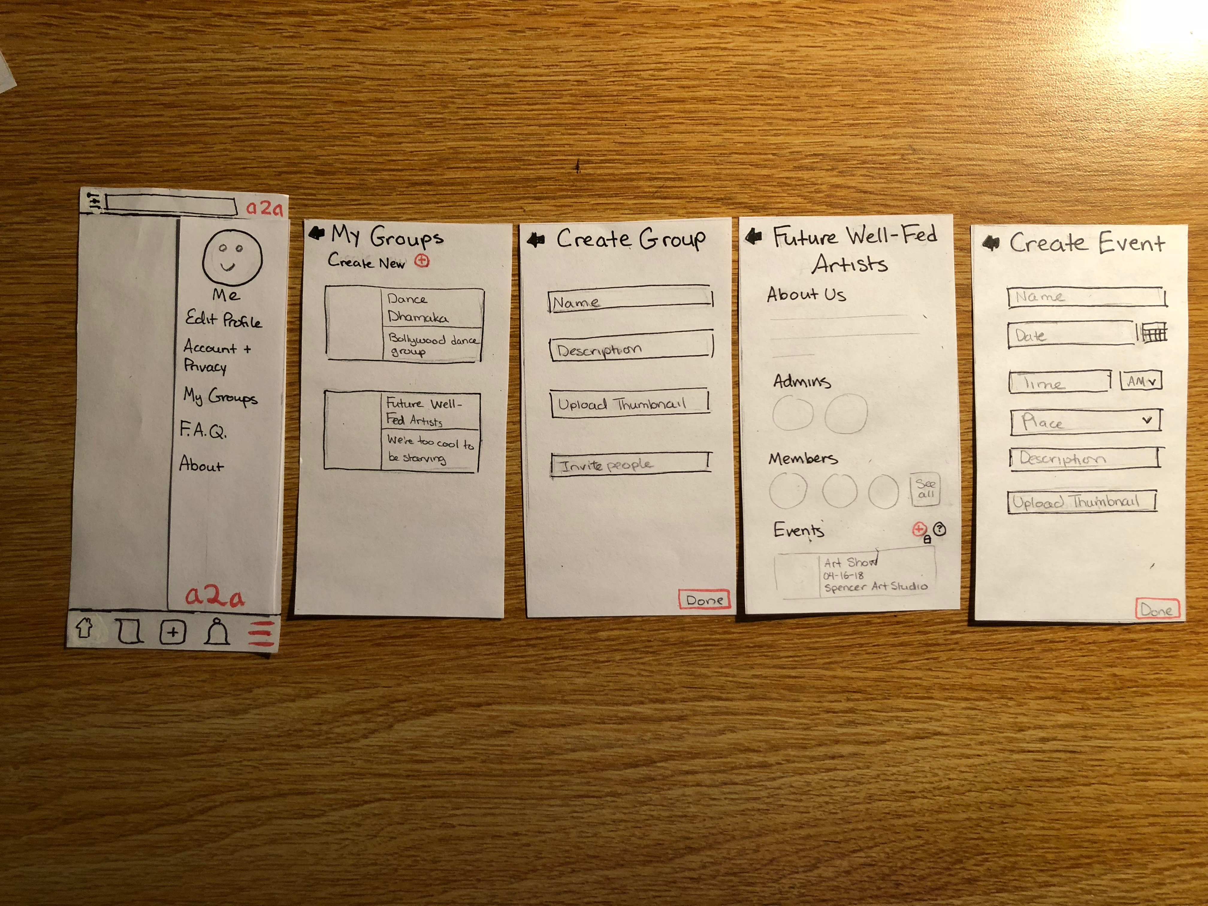
Incident 3: Suspicion of groups and events
User was wary of individual ability to post events, as they do not want to be spammed with “fake” or “joke” events. User wants to restrict ability to post events to just groups, which brings up the concept of having group profiles.
Severity: Medium
Explanation: Although the fear of having fake or joke events created by individuals is legitimate, we still want to be able to provide the ability to create events for individuals for the cases of individual shows, solo showcases, recitals, etc. However, it is a good concept to have the ability to create groups in a2a, so we have added that workflow into a2a.
Visual
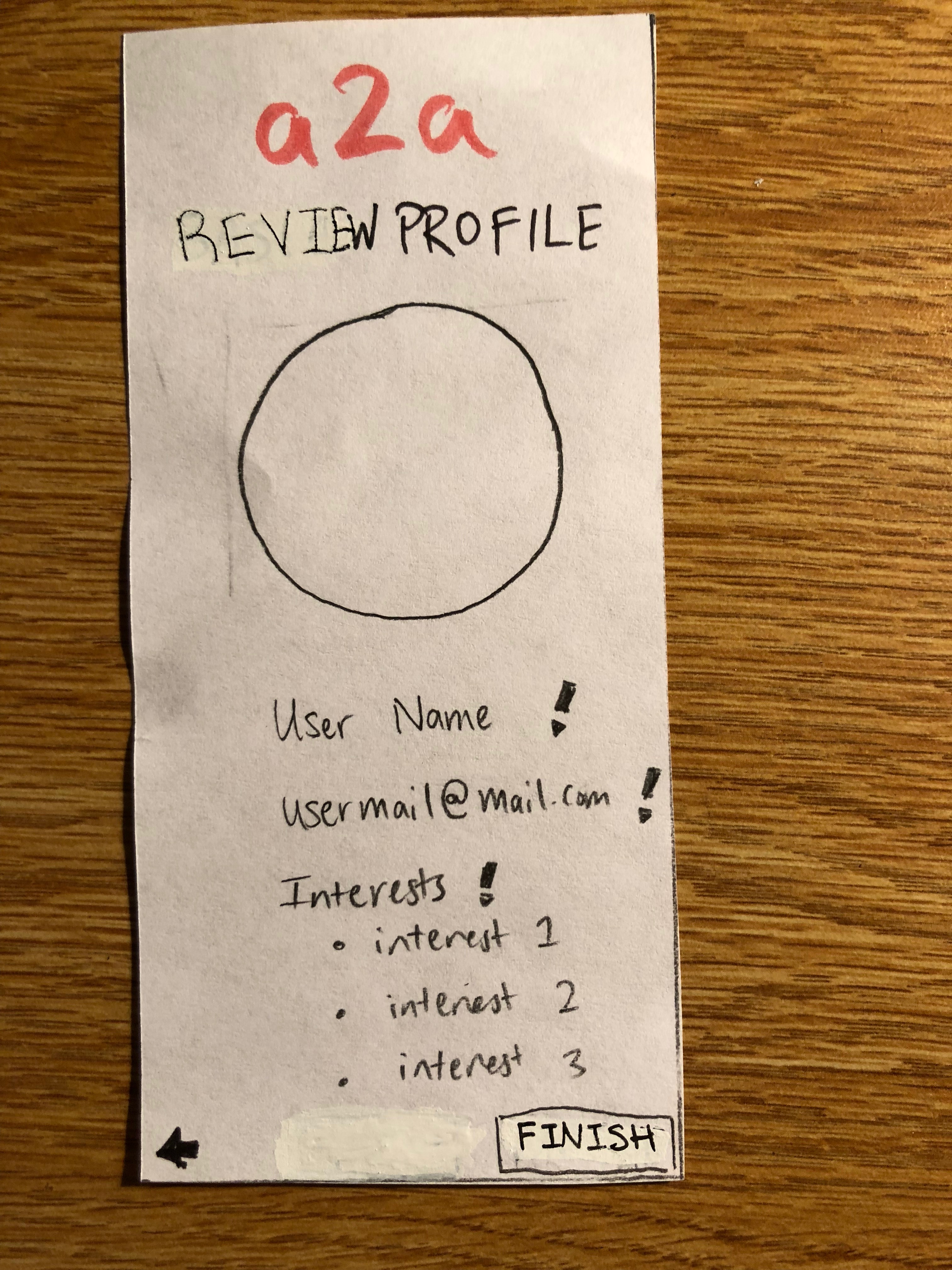
Incident 4: Confusion in Onboarding
User was confused during the profile overview portion of the onboarding process - they thought they had to re-enter all the information.
Severity: Medium
Explanation: The review screen which gives an overview of the user’s profile as they’ve formed it has the vague profile “Basic Profile”, and the “finish” button doesn’t stand out as much as it should, which is probably what led to this confusion. To help resolve these issues, we renamed the “Basic Profile” screen to something like “Review Information” or “Review Profile”. We also changed the color of the “finish” button from black to peach to make it stand out more.
Visual
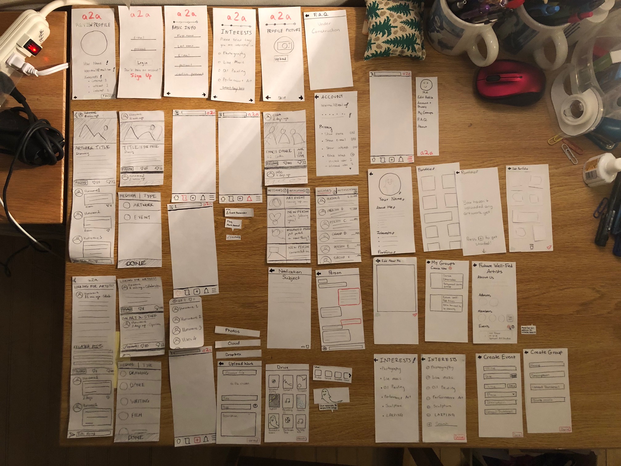
Paper Prototype
Below is an overview of our finalized paper prototype:
At this point, our two main tasks, event discovery and notification and art showcasing, are as they were in the last revision. Please refer to the detailed walkthroughs found in our Usability Testing Check-In.
Most Important Revisions
Important Revision 1: Fixed Upload
The “Upload” workflow in our initial design was unclear in many places, such as how to upload a file (there were three options and some very useless labels associated with them), and had some unnecessary functions, such as using the device’s camera to take images on the spot. To fix the upload issue, we condensed the different places from which to upload a file, such as the device’s photo album or an external drive such as Google Drive or Dropbox, under one button. We also removed the camera functionality, since most visual and auditory artists will usually pre-record or photograph and edit their work before considering it ready for upload. Finally, we condensed everything onto one page to make uploading an art file cleaner and more consistent for the user.
Important Revision 2: Fixed Buttons
In our initial design, we tried to use fun icons that weren’t your stereotypical house-as-home-button sort of thing. For example, for our “home/main feed” button we used an artist’s palette; for our “follow” button we used an eye. However, our users, and even we ourselves, found attaching meaning to these buttons confusing. Users (and even the team member who wrote up the paper prototype section) didn’t know that the eye icon in under each feed item was actually the “follow” button, leading them to attribute the “follow” function with the now-removed “share” button, and other things like that. This helped us realize that we needed to take a step back from trying to be ‘cute and fun’ and focus on being clear about each button’s function. So now we’ve reverted back to what users expect and/or can easily interpret - our “home” button is a house and our “follow” button is clearly labeled “follow”.
Important Revision 3: Dealt with Inconsistencies
We had a few silly consistency issues in our app, some of which stemmed from not all checking back in while we were making our paper prototype, and some of which were carefully considered and created all the same. The accidental consistency issues had to do with button placement throughout the app, particularly the “back” button. Our gloriously ridiculous notifications speech-bubble-style box that popped up when the user hit the notification button instead of the expected separate page was our consciously inserted element that led to inconsistency.