Inspection Results
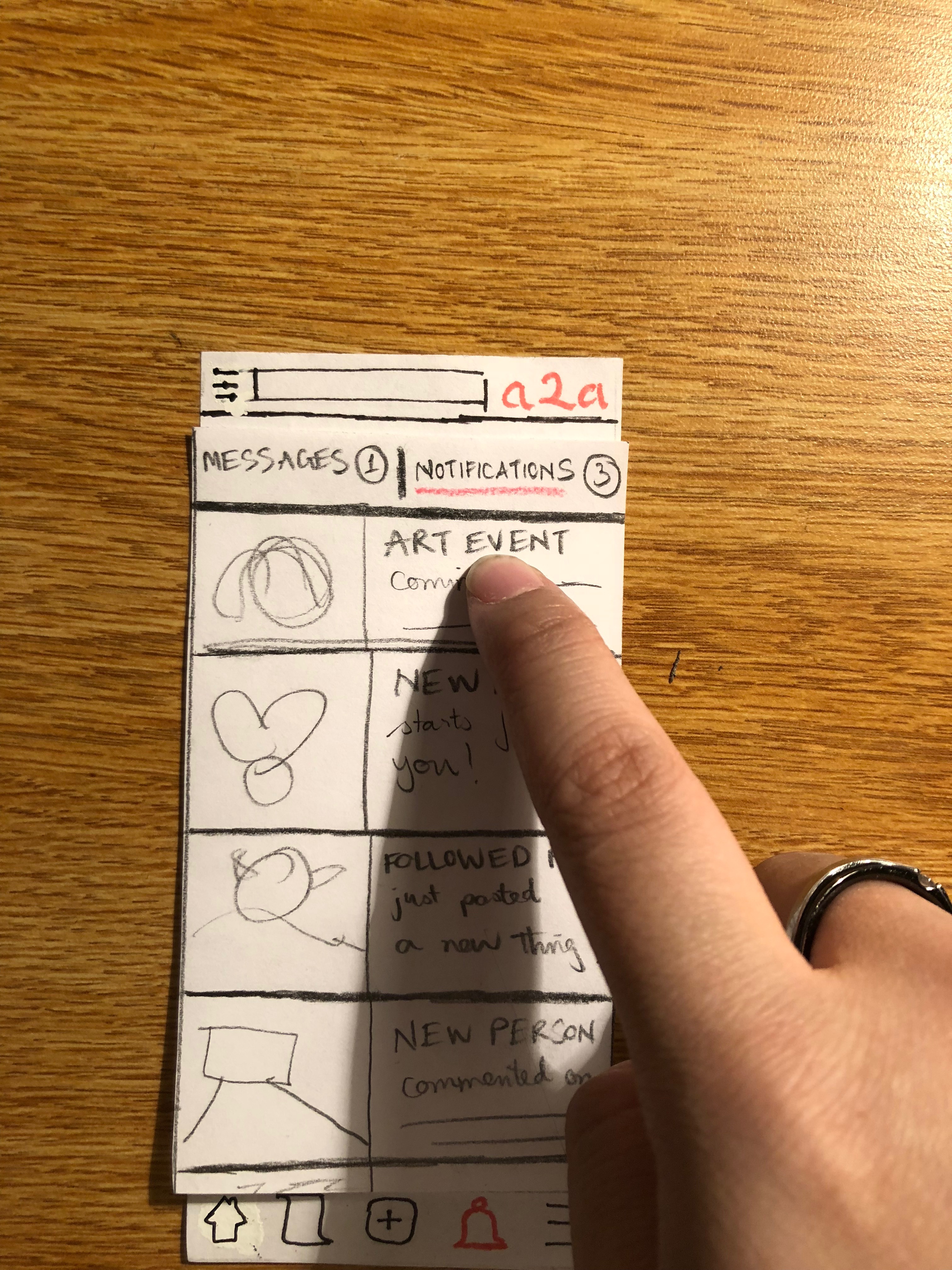
1. Inconsistency of Notification Tab
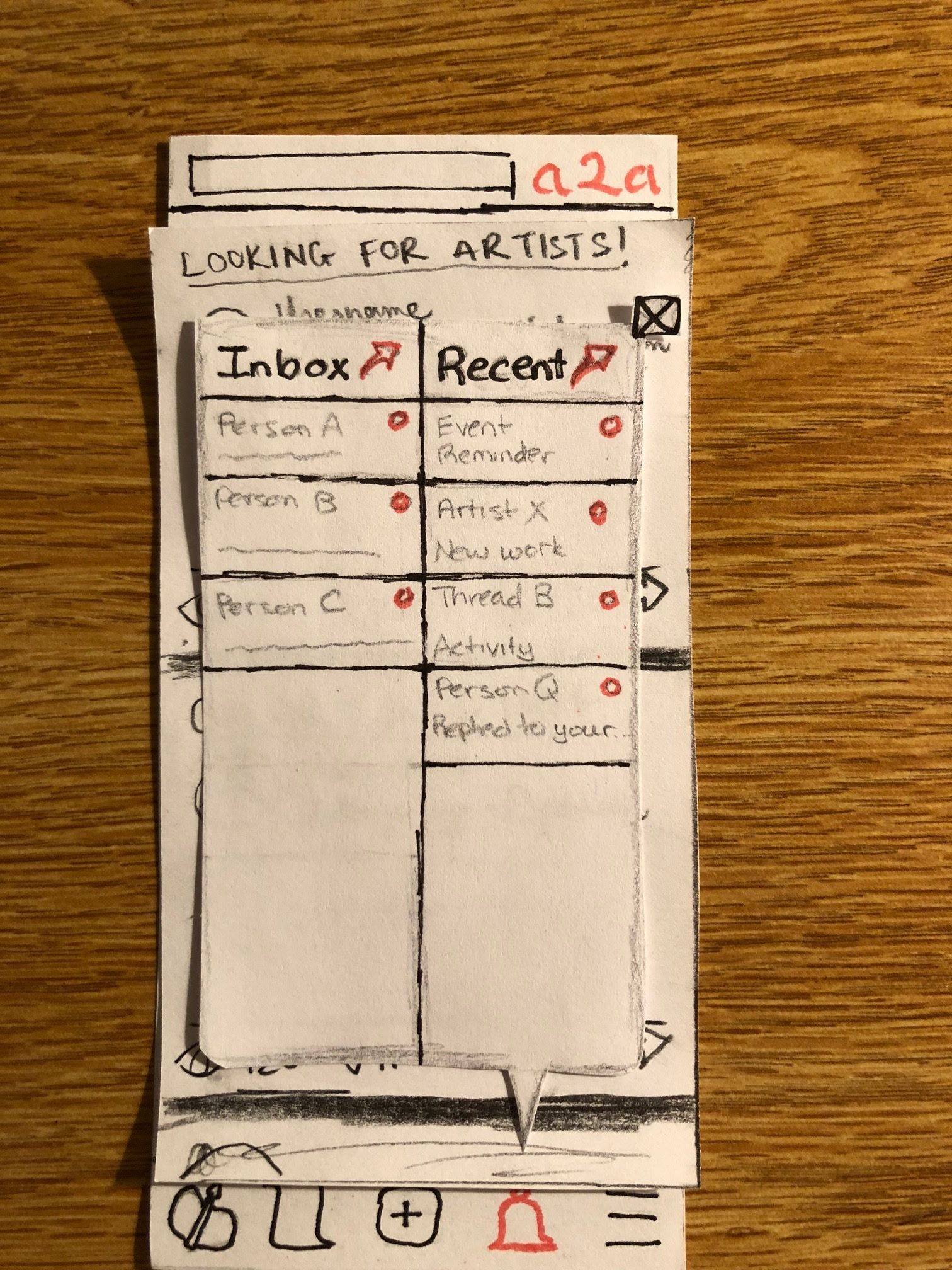
Problem: The notification tab opens up a dialog box instead of a full page like the other sections. Users are confused about whether they should navigate this section in a different way compared to other sections that they have seen. Moreover, the inbox and notification sub-sections are squeezed together into one screenful, presenting users with a very crowded interface.
Heuristics Violated: Consistency and Standards. Minimalist Design.
Severity Rating: 2
Revision:
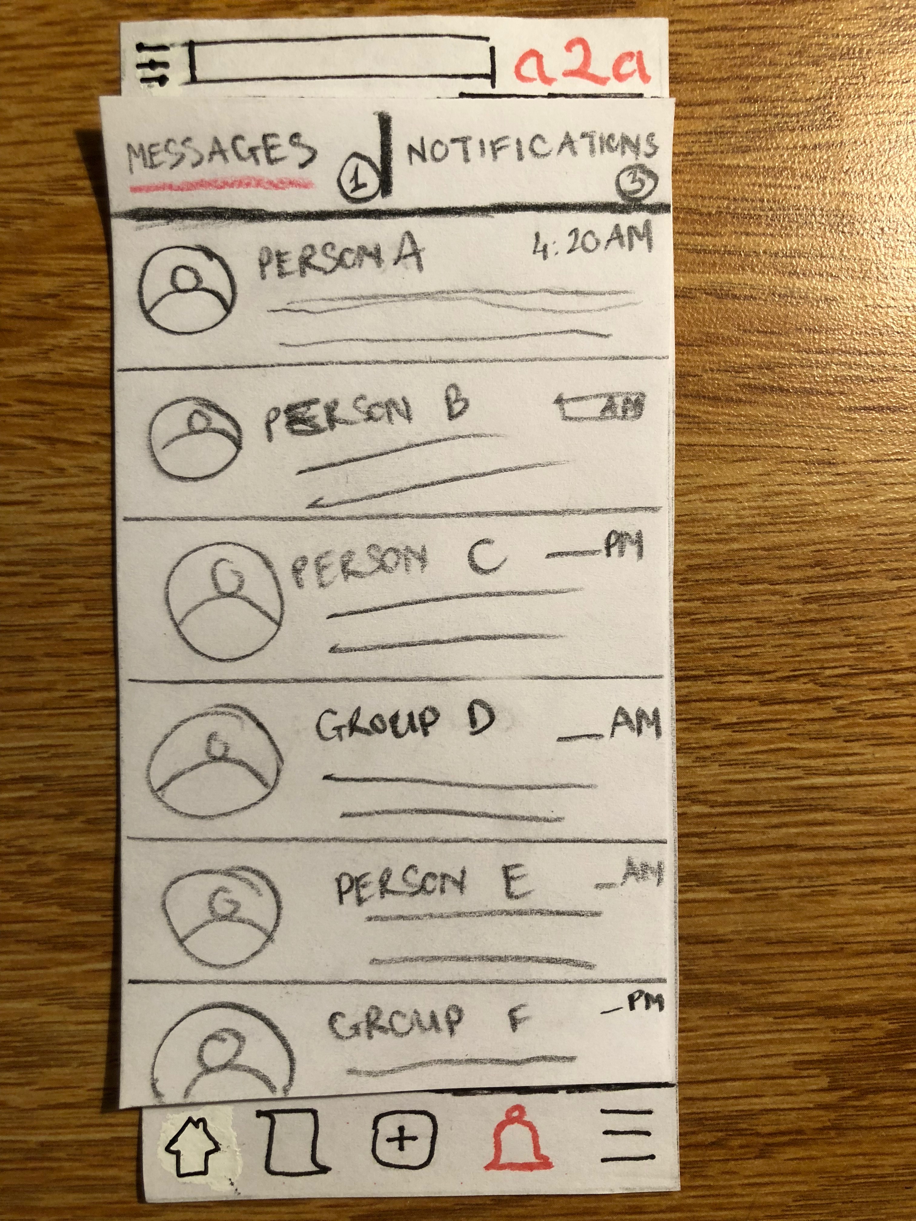
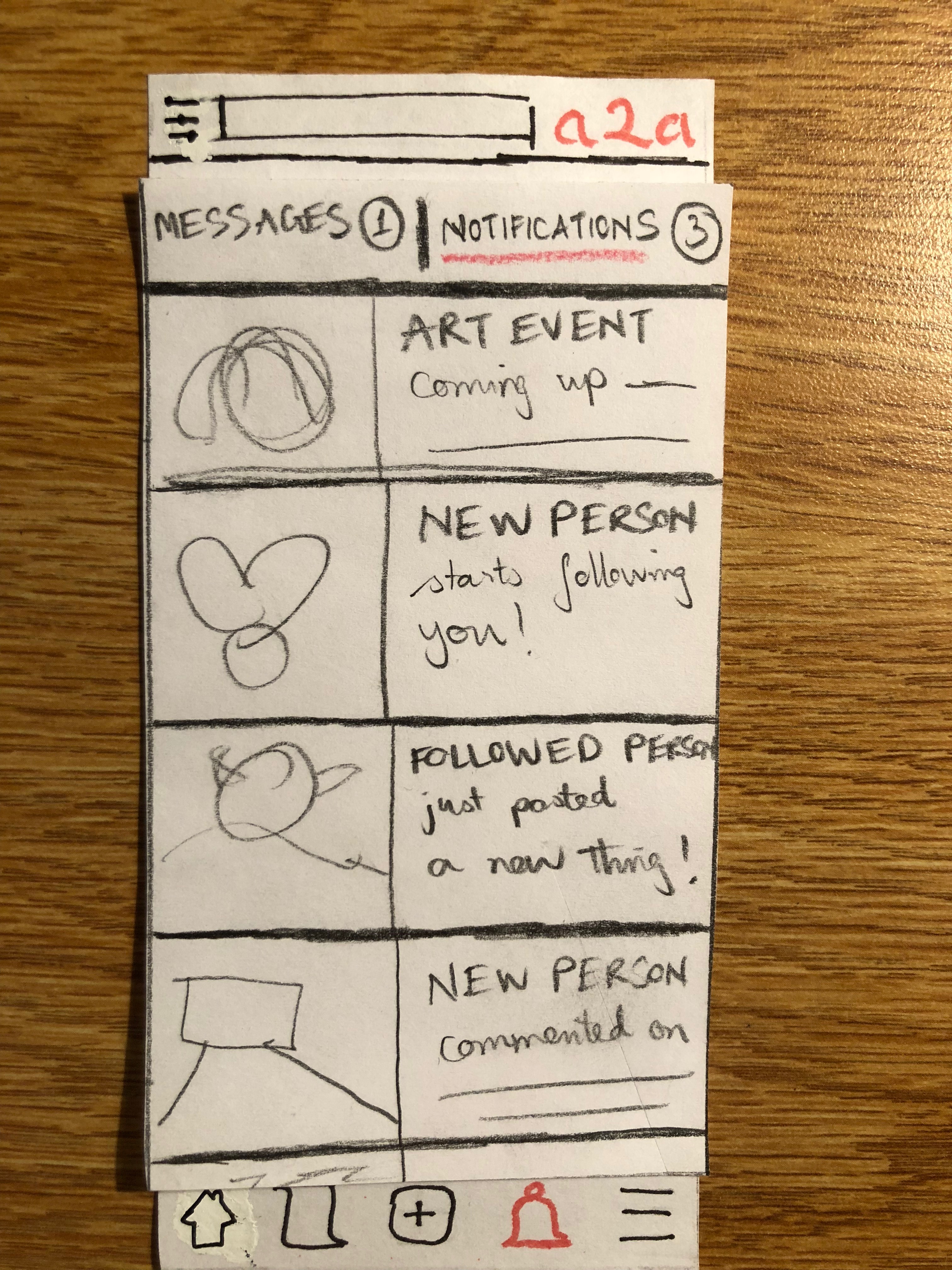
We reworked the notification section into a full page, similar to other tabbed sections. We also renamed the “Recent” sub-section to “Notifications” and “Inbox” to “Messages” to avoid confusion. Only one of the sub-sections is displayed at a time, and users can switch between using a handy tab at the top of the page.
2. Inconsistency in Upload Workflow
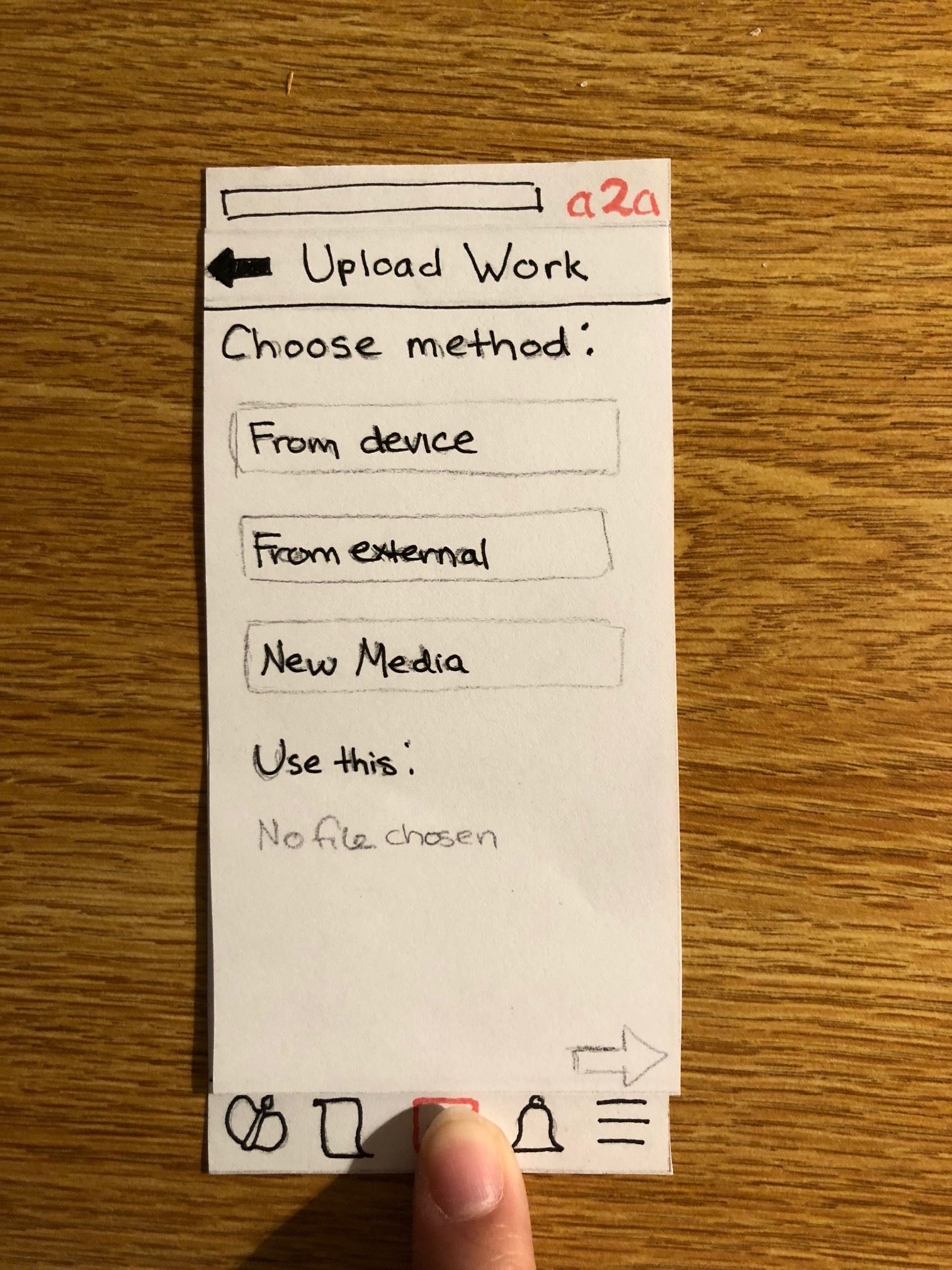
Problem: There were too many options for uploading files, and the naming convention made no sense to users.
Heuristics Violated: Match between system and real world. Minimalist design.
Severity Rating: 3
Revision:
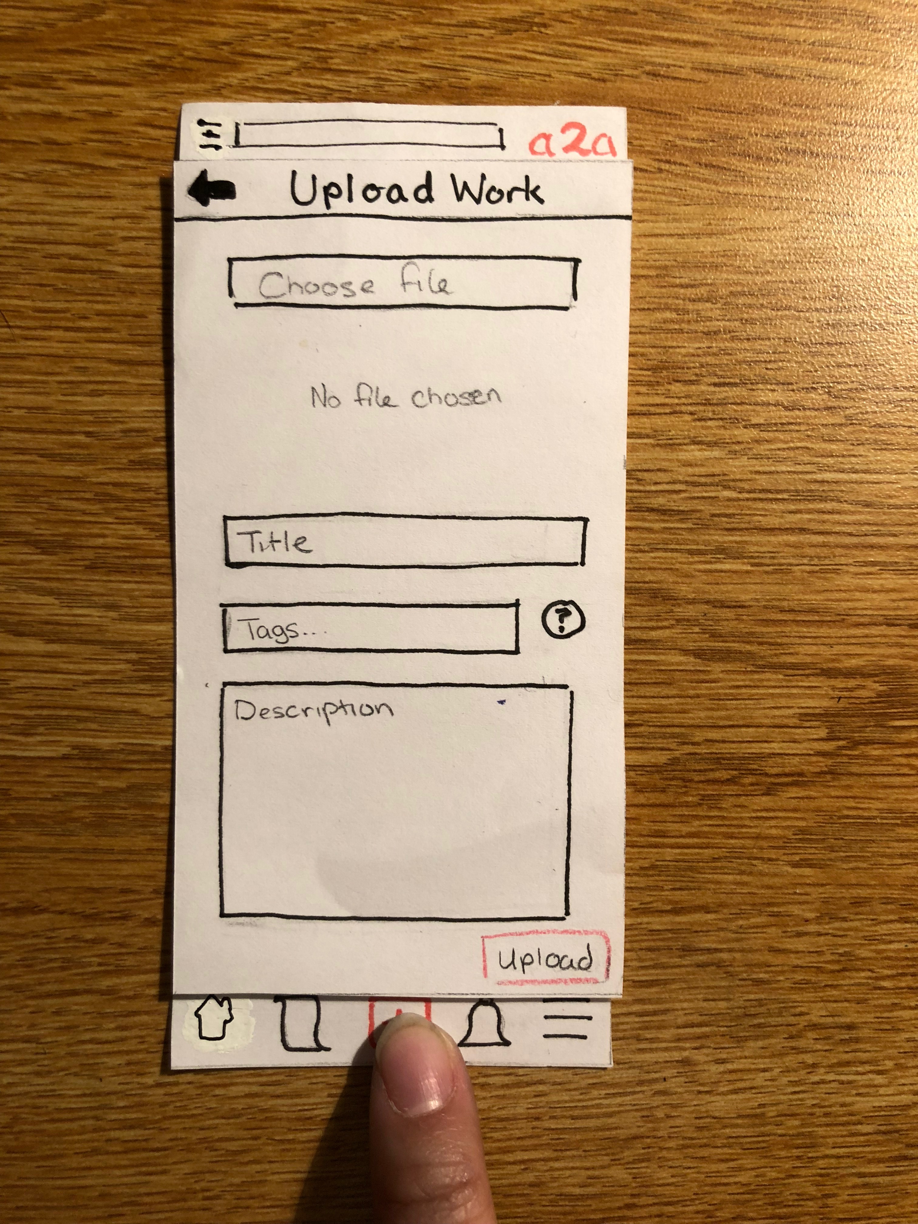
We consildated all upload options into one button called “Choose File”, so that the user can choose files of any type from their phone or from compatible apps. We also removed the option to take a photo or video directly via camera. This is because we realized most artists who upload visual work would likely digitally edit their images beforehand, and so wouldn’t need the camera.
3. Inconsistency in Back Button Placements
Problem: For most of our design, the “Back” button of each screen is placed at the upper left corner of the interface. However, for some sections, the button has been placed at the end of a field to be filled in, requiring users to spend extra time locating the simple, commonly used feature.
Heuristic Violated: Consistency and Standards.
Severity Rating: 1
Revision:
We relocated the “Back” button to the upper left corner, standardizing all parts of the interface.
4. No Help
Problem: We did not include any method for finding help to use the app.
Heuristic Violated: Help and Documentation
Severity Rating: 2
Revision:
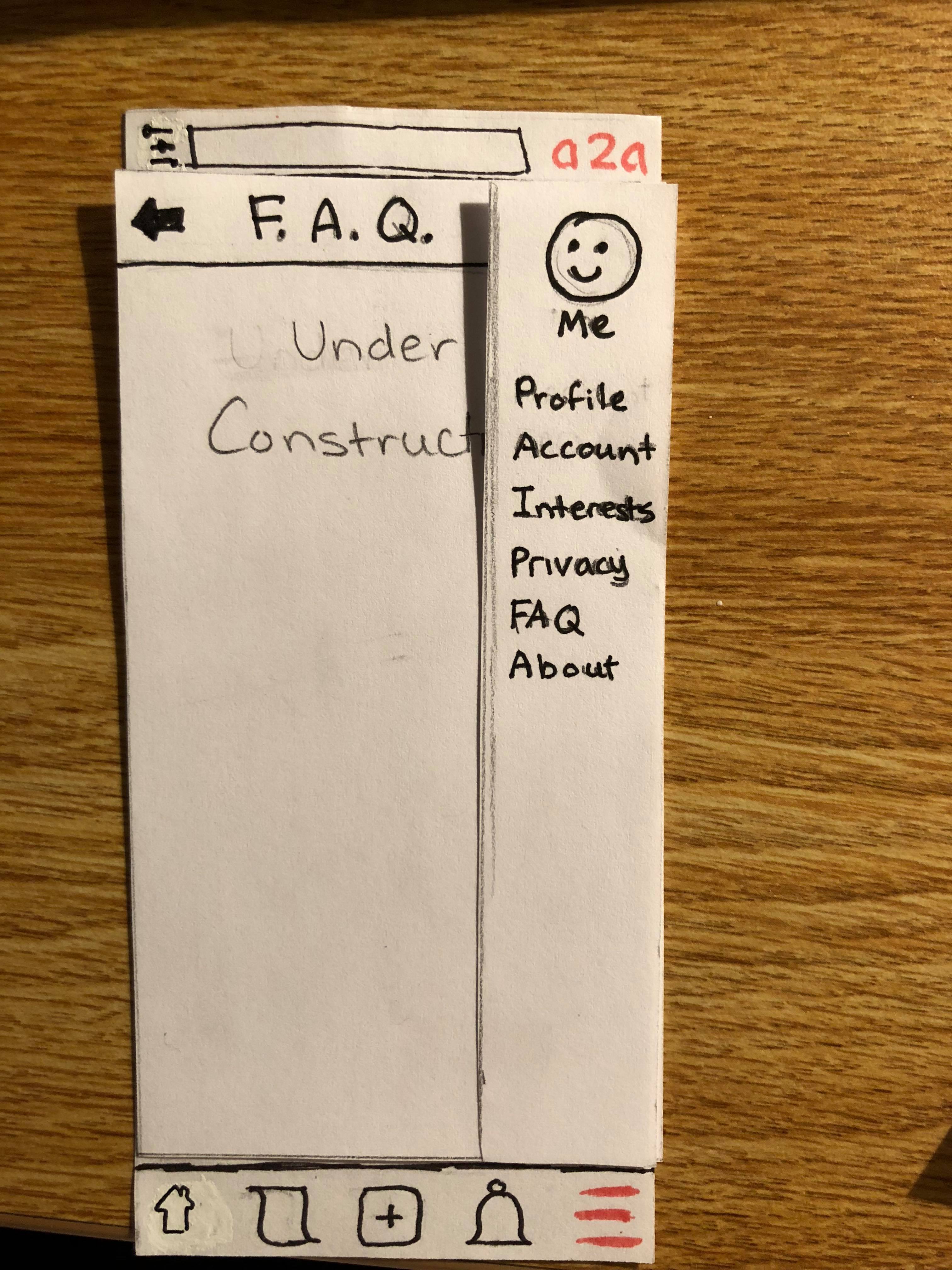
We added an FAQ option to the side menu and left it under construction while we gather more data on what questions fall into the “frequently asked” category.
First Usability Test
CKY is an undergraduate senior at Williams College majoring in Computer Science. A former participant in our series of contextual inquiries, CKY is a potential user - a student artist at a rural, small college who constantly seeks out new arts and artists in the vicinity. They also wish to advertise their projects, in hope of connecting with possible collaborators.
We conducted the test in Jesup Hall, where student artists typically go to for digital pre-processing needs. KY often take advantage of the high-spec, well-calibrated computers here to edit photos, videos, or posters before posting them. In their free time, they also often check for new arts and events on social media.
At the beginning of the test, we provided KY with some background on our project and instructed them to complete two tasks, uploading a new art piece and following a new event, while thinking out loud throughout the process. We did not answer any questions they raised, and we sometimes asked our own questions to clarify their confusion with various aspects of the app. Quan was the computer, Grace was the observer, and both were the facilitator.
There were two effective strategies that we would continue using: (1) allowing KY to think out loud and (2) occasionally probing them to point at the specific features that stumped them. At the same time, there were several times where Quan interrupted Grace to write down some additional observations, or Grace interrupted Quan to work the interface in a different way. Allowing some flexibility in our testing roles is great, but for subsequent tests, it might be great to minimize such disruptive switching. In addition, we need to be careful to mind the fine line between letting our user figure out what they’re doing and letting them explore the interface for the sake of exploration rather than for the task.
Issues Discovered in this Test
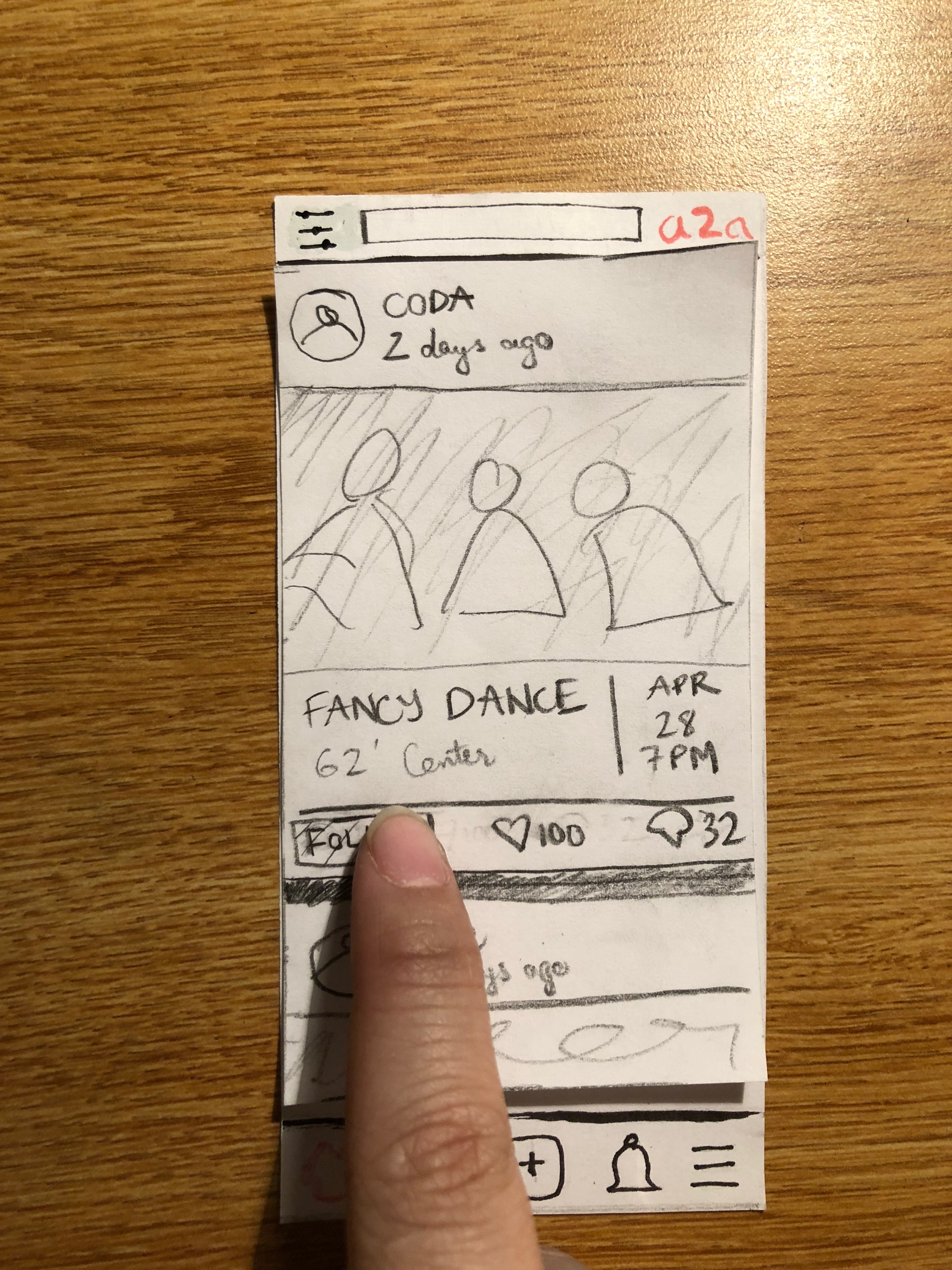
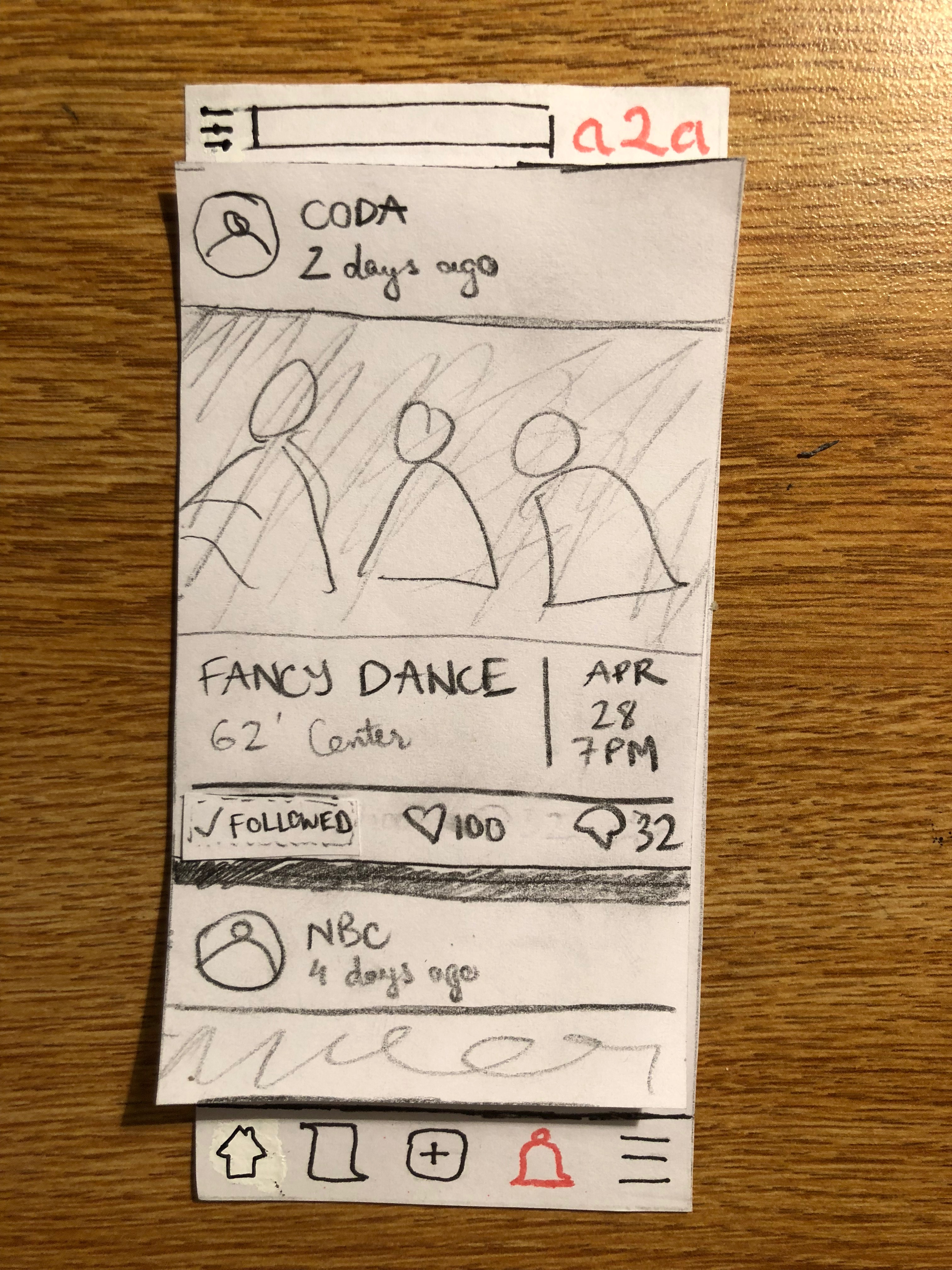
1. Confusing icons in Feed Section
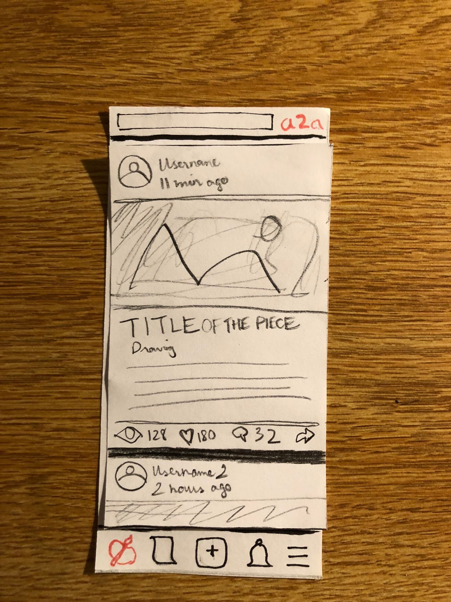
Problem: The interactive portion of each Feed post is cluttered with the “View” count (eye icon) and an unrecognizable “Follow” icon (arrow icon). First-time users might be confused by all of these icons and would take some experimentation to get used to.
Severity Rating: 2
Revision:
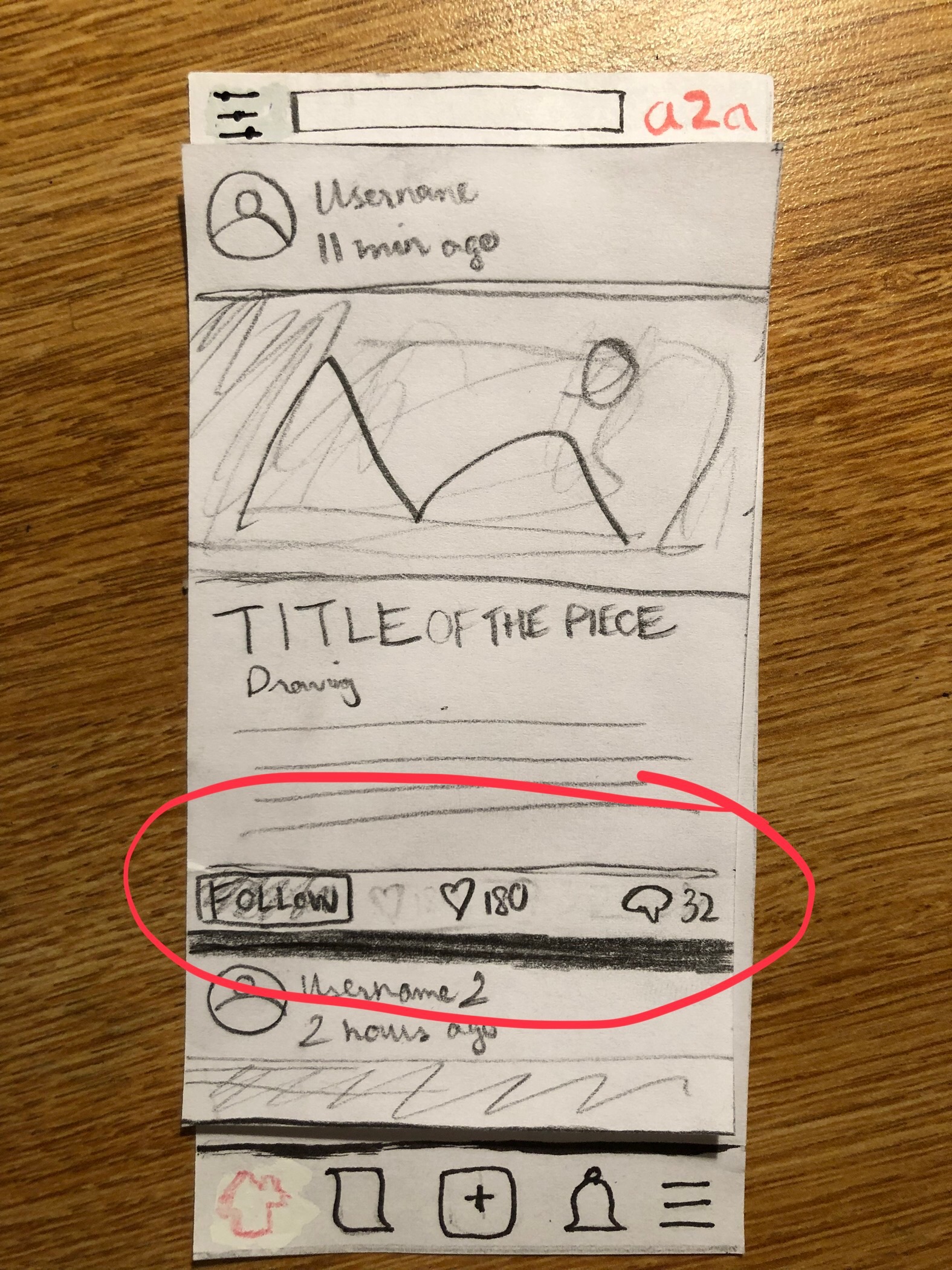
We simplified the possible tasks for each Feed post. Now users can comment, like, and follow a post. The follow functionality is designated with an conspicuous written “Follow” label to avoid confusion.
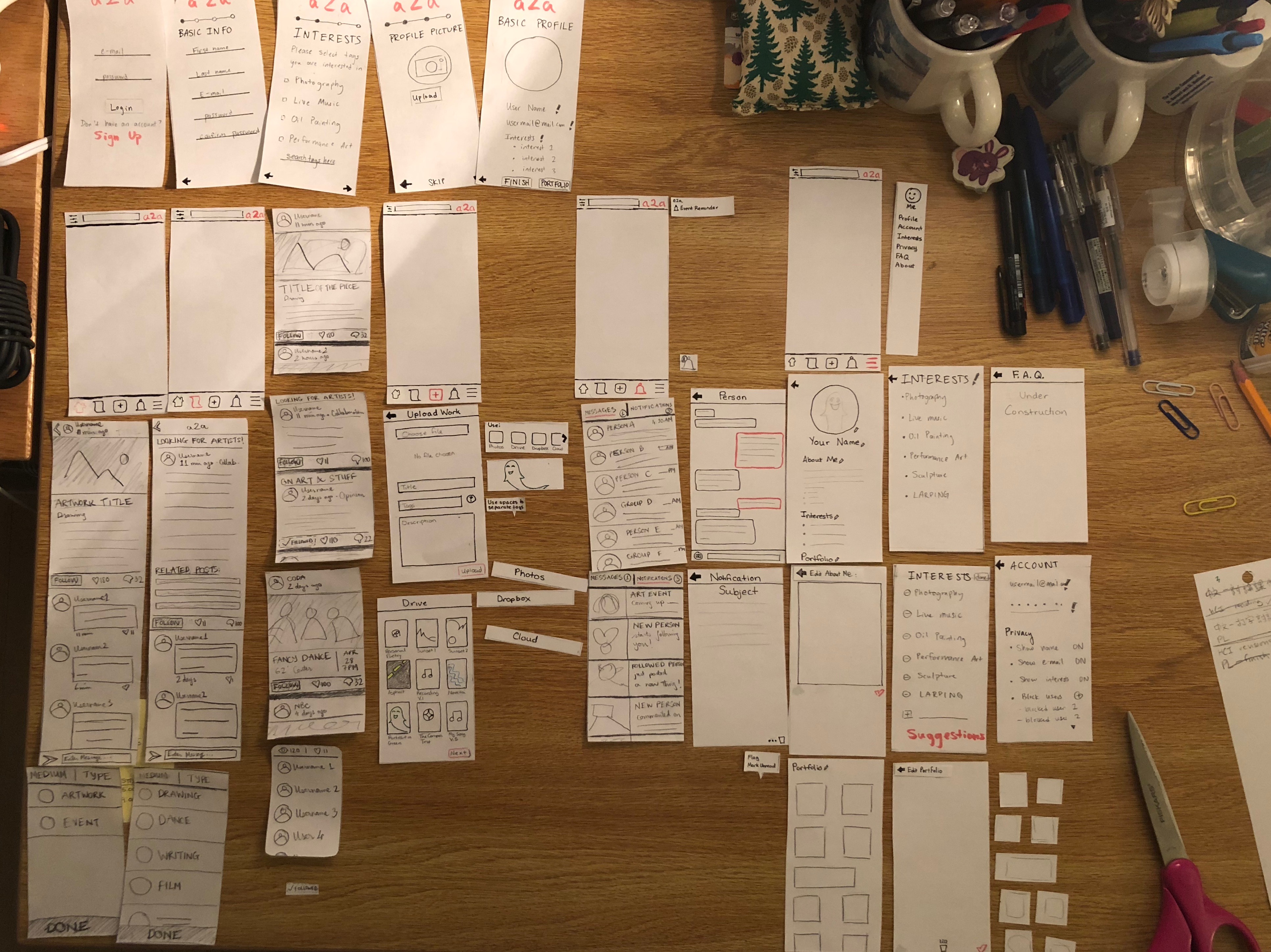
REVISED PROTOTYPE
Below is the full revised prototype:
TASK 1: Event Discovery and Notification
Below are the details of the revised prototype:
The user finds an event which interests them.
They touch the “follow” icon to tell a2a that they’d like to be reminded about the event when it draws near.
When it’s time, the user receives a notification about the event.
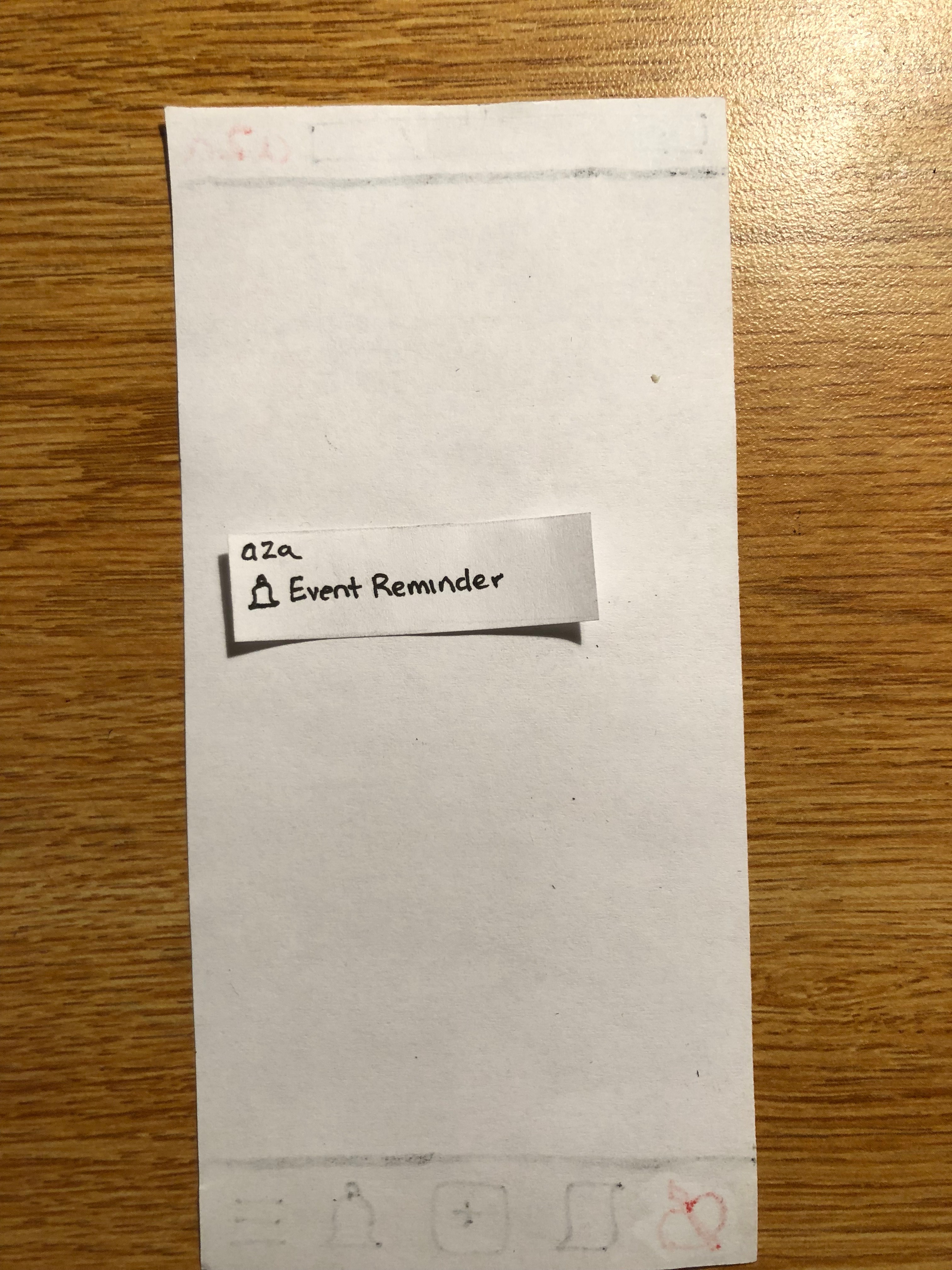
They open the notification on their phone and a2a opens. They can touch the notification about the event, which will bring them to the Event post.
Task 2: Art Showcasing
Below are the details of the revised and shorted prototype:
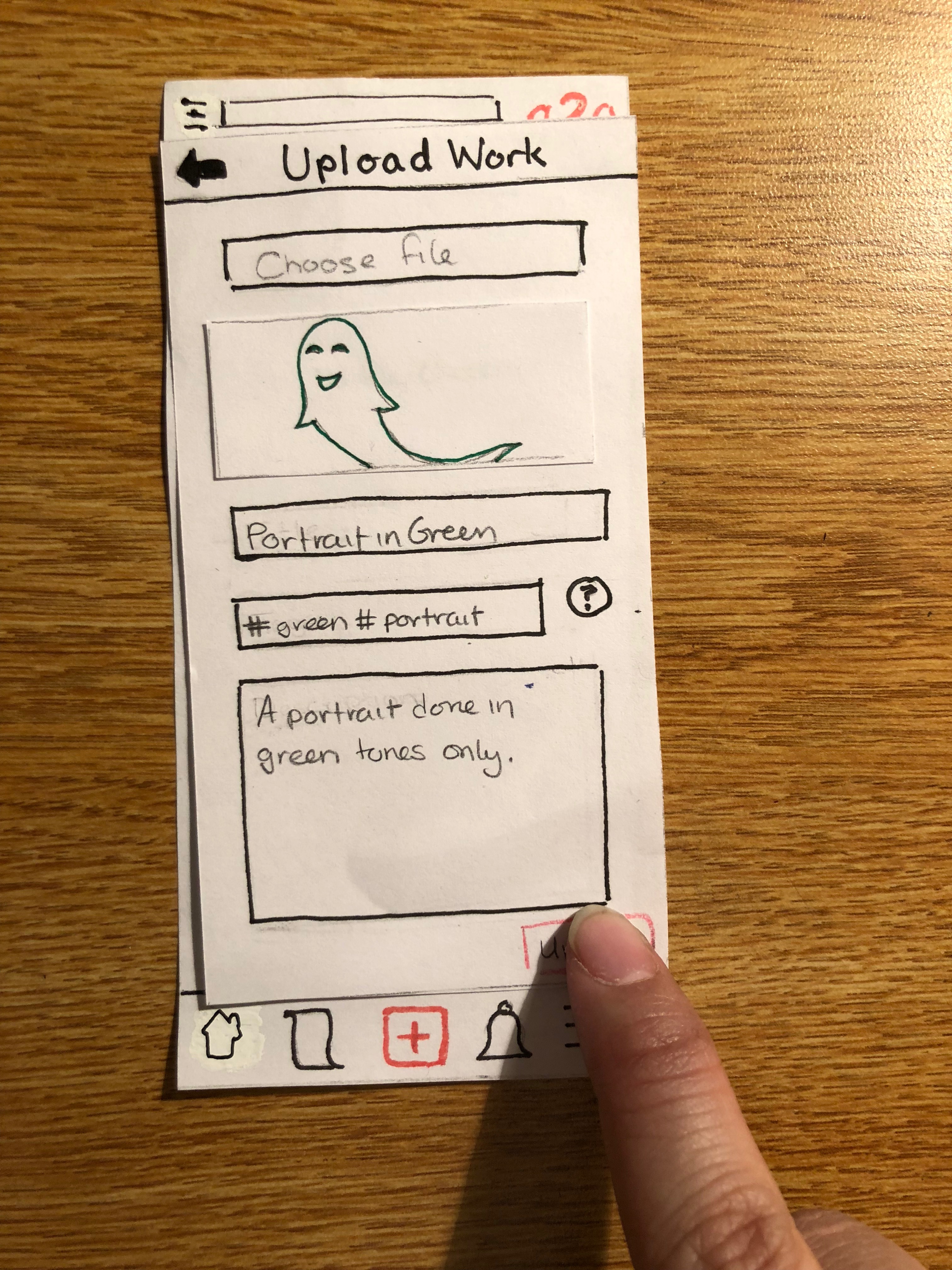
To begin uploading a file, the user presses the middle button on the tool bar, and are presented with an upload screen, which allows them to choose the file they wish to upload, the title of the piece, the option to add tags to help other users find the piece via search or interest group, and the option to add a description.
Touching “Choose File” opens a menu which allows the user to select a file from either their own phone’s photo album, or from some other compatible application such as Drive or Dropbox.
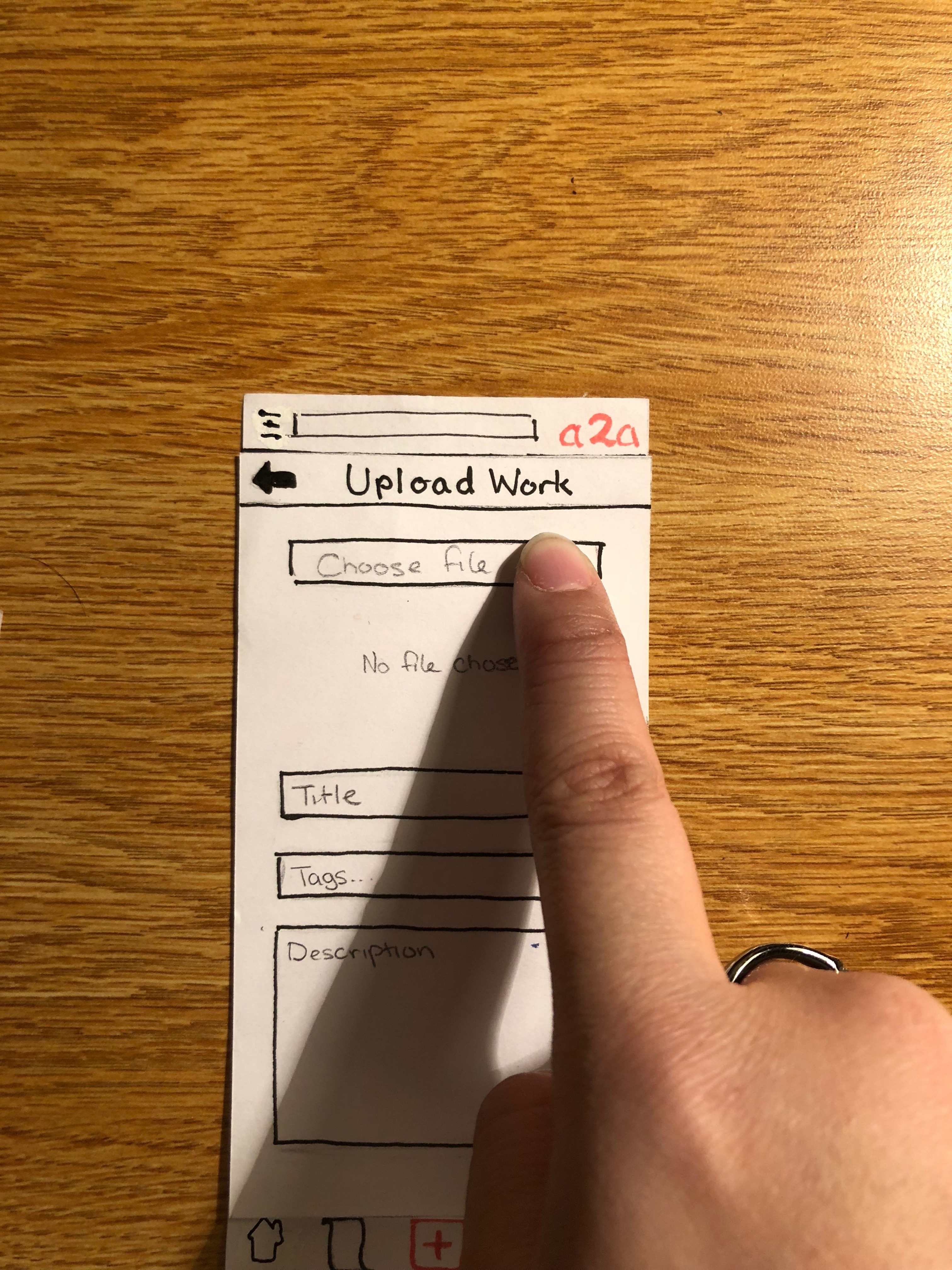
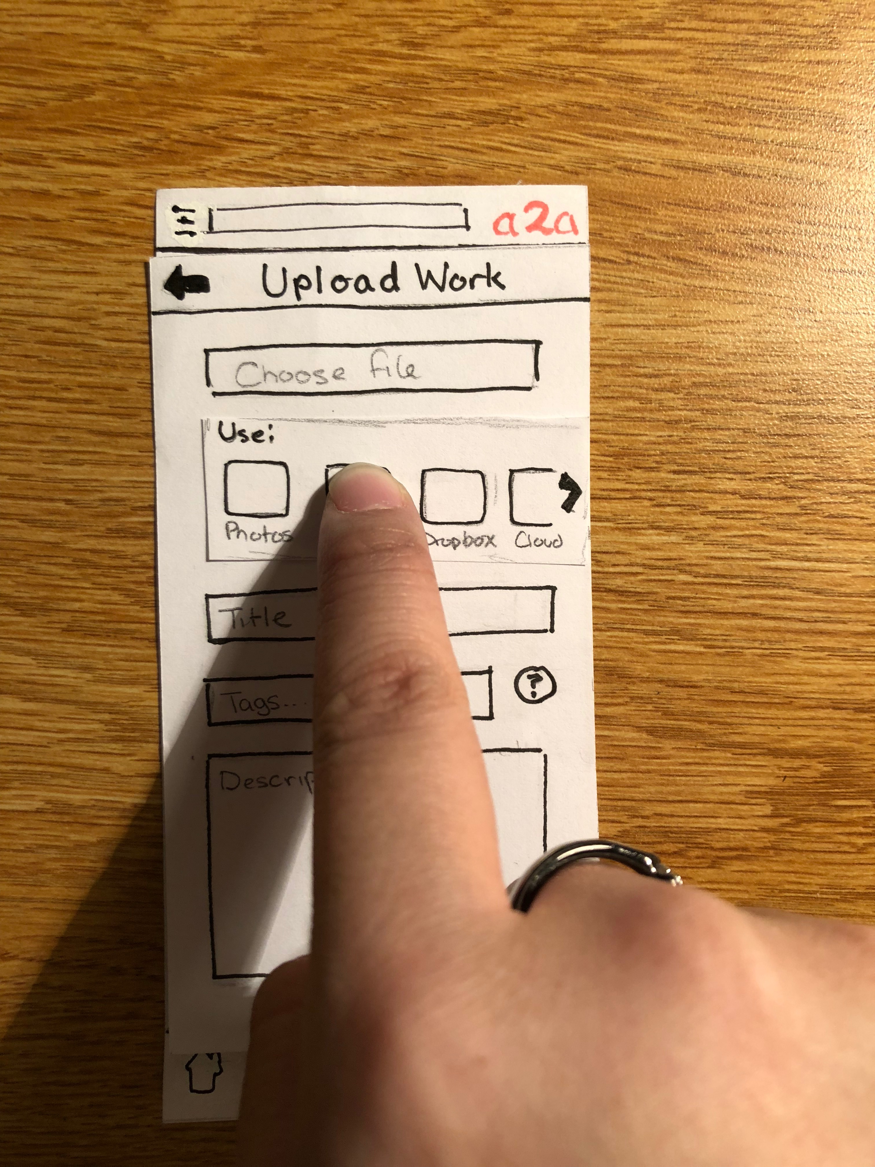
The user can then select the file which they’d like to upload.
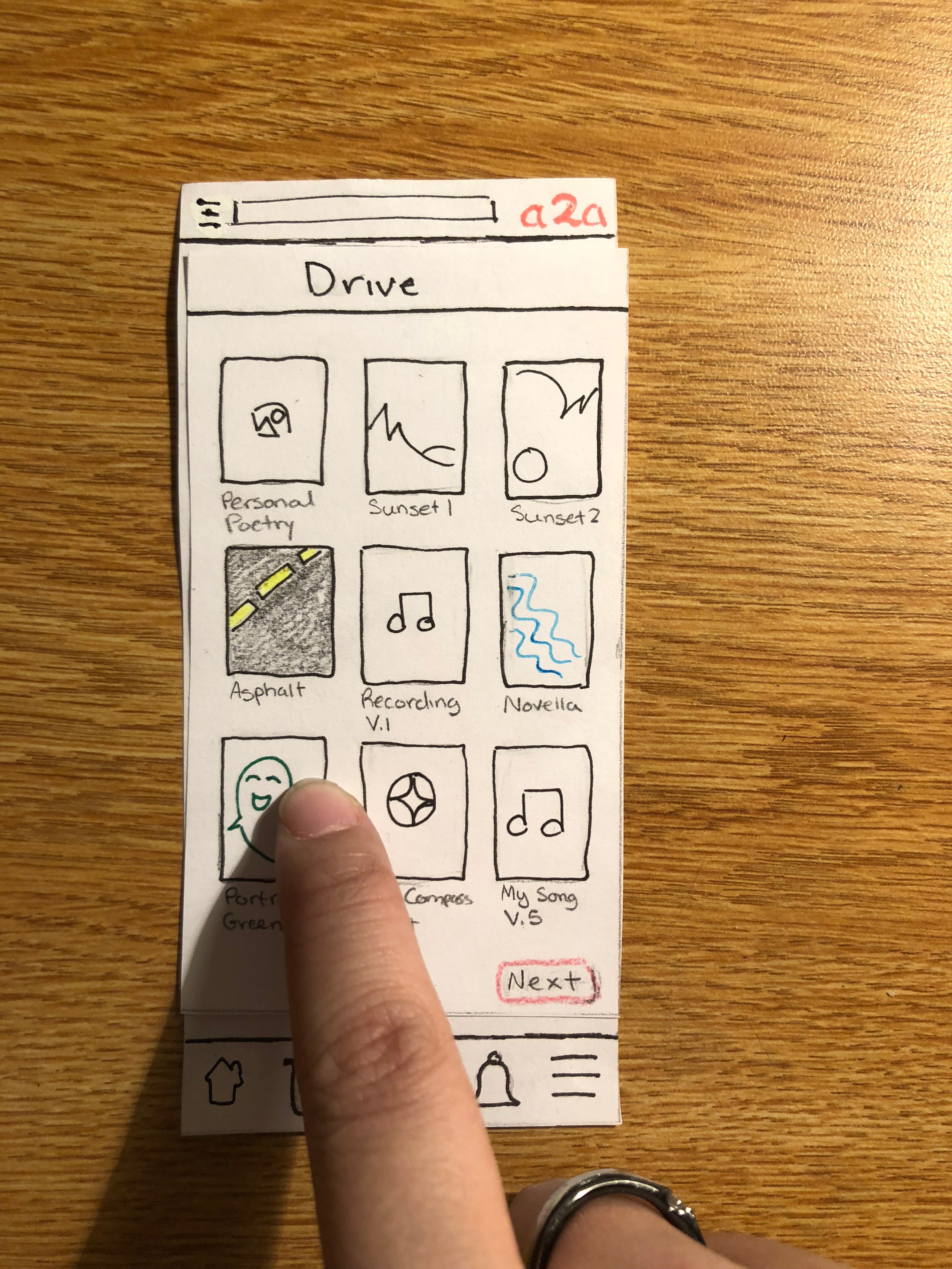
Once the file is selected, the user can fill in the additional information as they please. If they don’t know how tags work, there is a little tooltip which can help them.
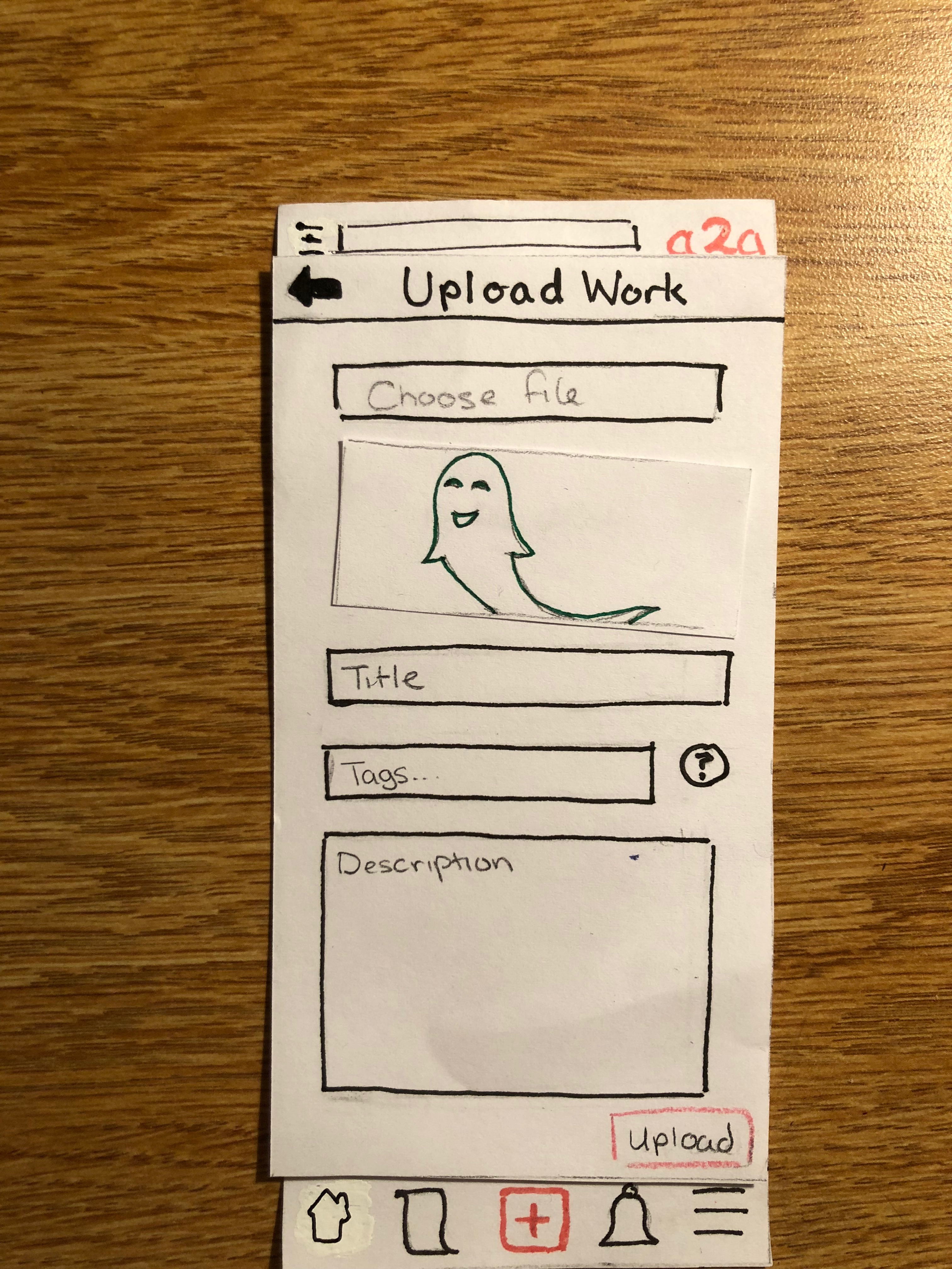
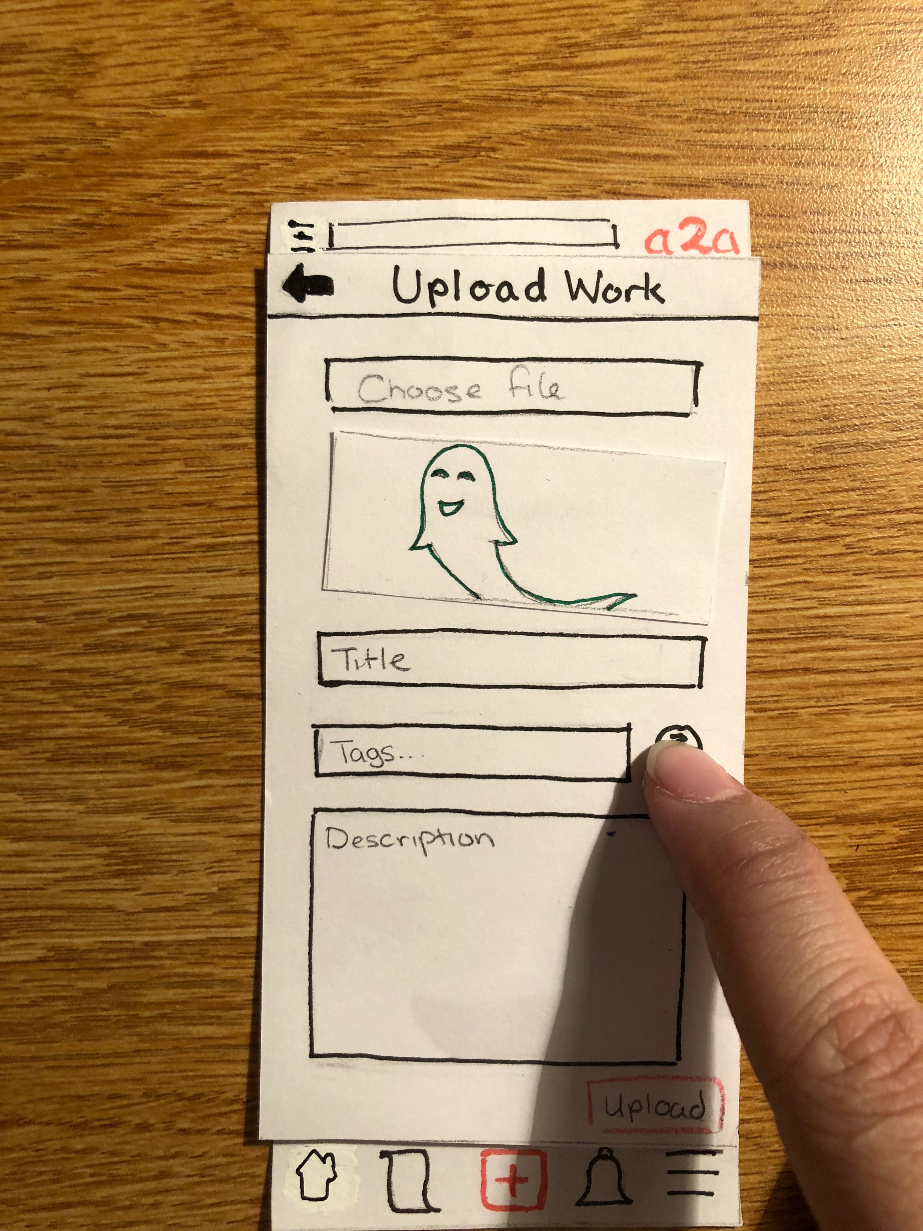
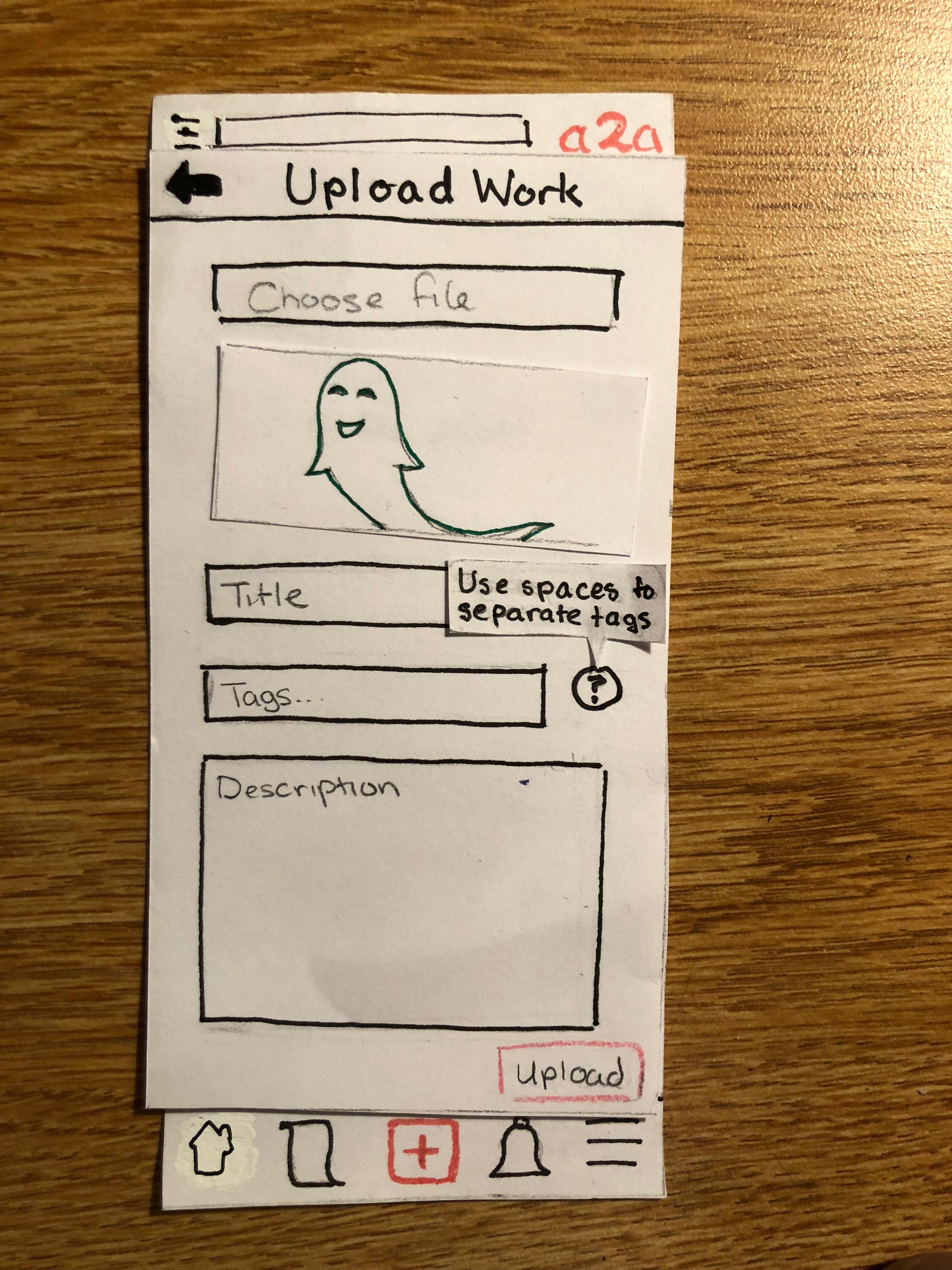
When the user is satisified, they can press upload to share their work with the community.
Plans Going Forward
We plan to test our design with one non-artist for certain. If we can find a non-student artist who’s available over the weekend, we will test our design with them; otherwise we will work with another student. In these additional tests, we want to make sure our revised buttons are intuitive across users, and we want to make sure our users are not distracted and stay on task. Distraction could be a sign that symbols are not clear, or less relevant ones are too prominent. Each member of the team would try each of the roles for experience, and everyone would be present at the test for more thorough note-taking and another set of eyes. Since Grace and Quan have already tried the roles of Facilitator and Computer respectively, ideally they would not reprise their roles. In addition, we will try to provide more specific tasks to our users, since a lack of concrete goal could lead to distraction and excessive exploration. For example, “upload a picture” versus “upload your favorite work, ‘Portrait in Green’”.